PROJECT:
Love Me Forever
CLIENT:
SUMMARY:
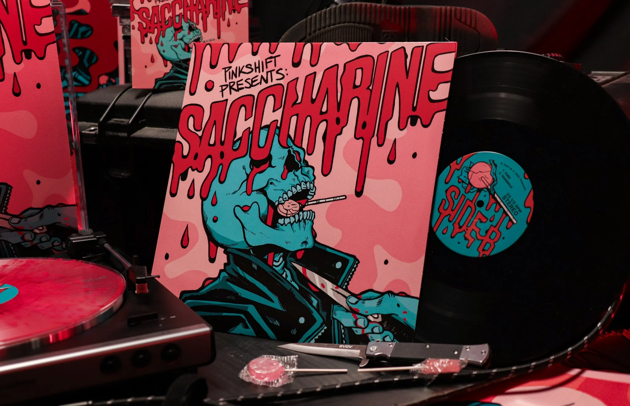
Love Me Forever is the debut studio length LP for post-punk band Pinkshift. I was lucky enough to collaborate with them on their previous project, Saccharine, and they extended an offer to work with me again spearheading creative direction and design for this new album cycle.
For this album project, I tackled packaging, admat design, and a number of additional deliverables like tshirts, patches, tour badges, and marketing materials.
INDUSTRY:
Music
SCOPE:
Packaging, Illustration, Merchandise
YEAR:
2022
ABOUT THE PROJECT
From the beginning, I knew that this was going to be a big aesthetic departure from the last project I worked on with Pinkshift, so it was important to approach things with a clean slate as the band was looking to establish a new design direction for this “era” of their discography.
Though similarly, they still opperated under a theme of contrast. They wanted a softer presentation that acted as a counter-balance to their post-punk and hardcore sound, while leaning into the floral and pink motifs established by their album art, show below.
ABOUT THE PROJECT
The Album Art
Photographed by Leigh-Ann Rogers, Pinkshift started the project with this photo firmly in place as the records album art. This acted as a cover and the aesthetic/tonal baseline for the project, and all encompassing deliverables.
This essentially acted as the key art for branding and design throughout the rest of the development process.
IDEATION & DESIGN
The Design Process
We started off with the packaging. During the initial treatment exploration, the band didn’t really have any layout or typography in mind, so we took the time to go through a variety of different options, adding in photo treatments, textures, graphical elements, and typography layouts so the band could get a better idea of what they did and didn’t want for this album.
All these concepts were fairly rough, and not too off the wall as far as treatment goes. The intention was to get a quick gauge on how far the band was willing to push past the initial starting image.
It was during this process that they firmly decided they wanted to go in minimalist direction, letting the photography speak over any other graphical element of the packaging.
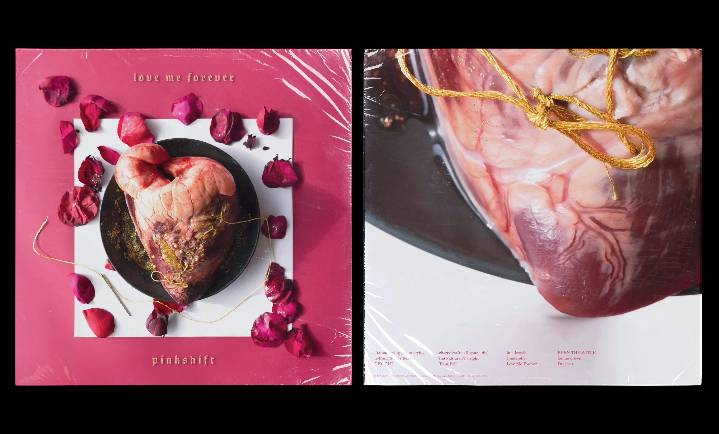
The Final Sleeve
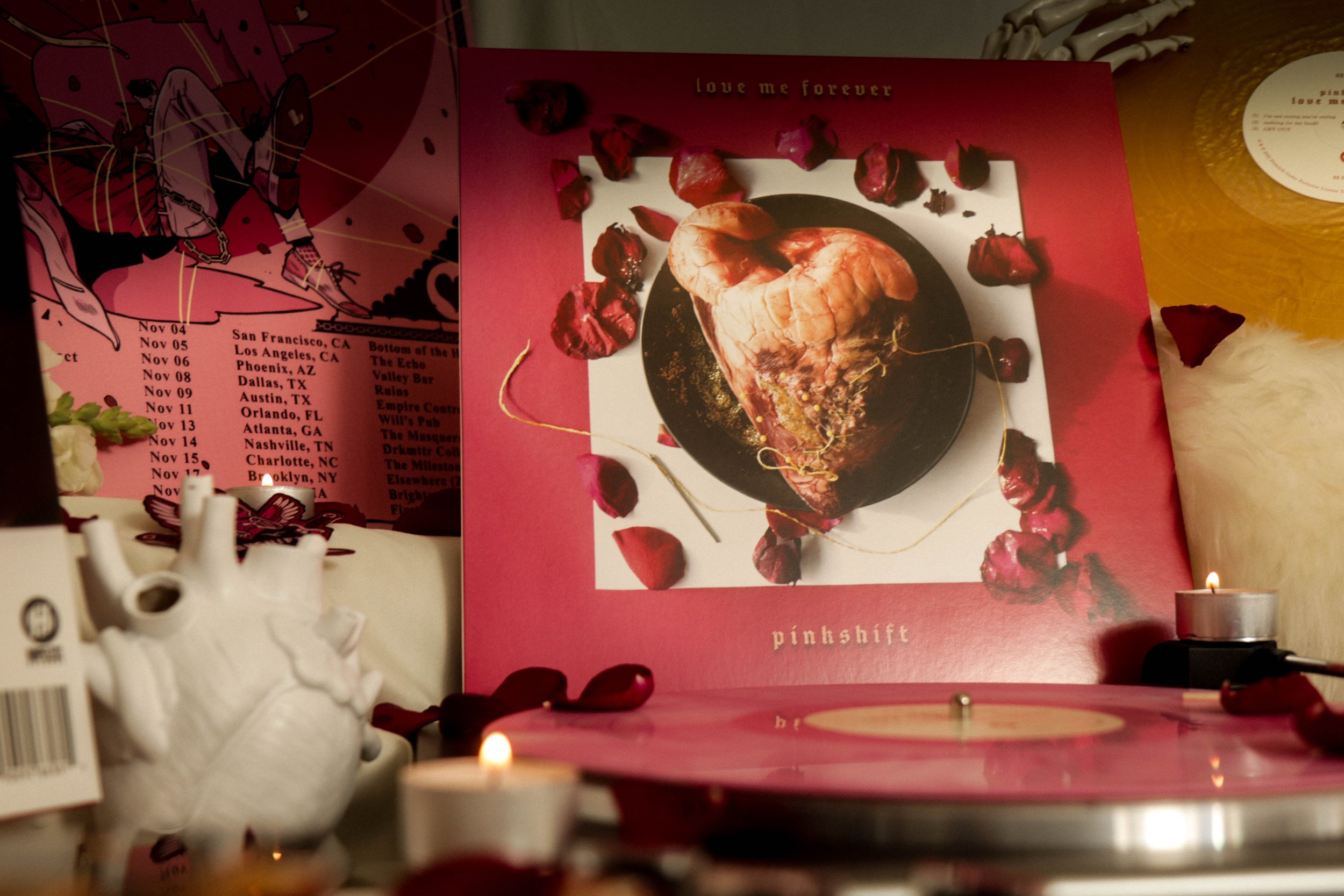
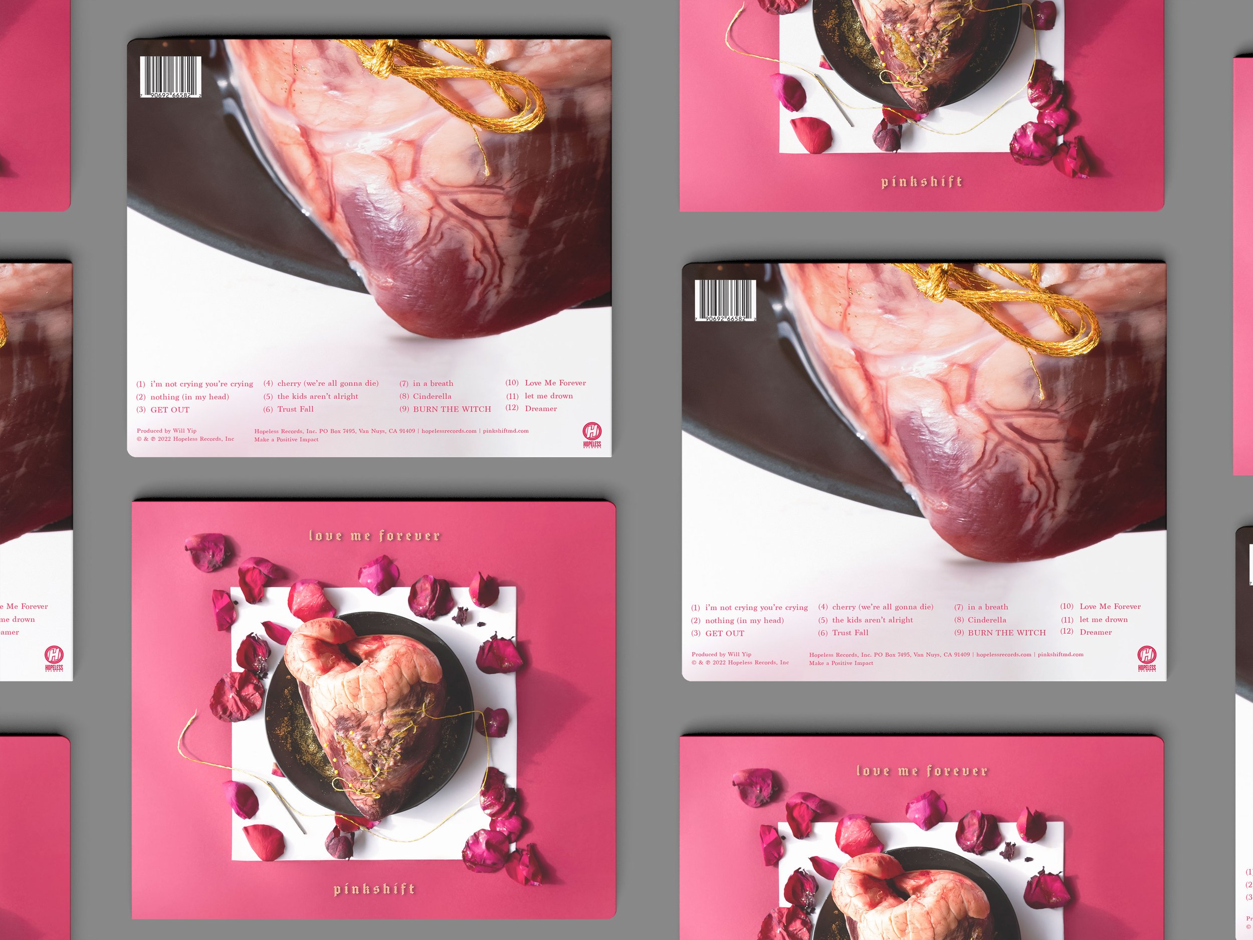
The band made it clear that photography would be the focus of this era.
Each design element balancing against the negative space of the photography and keeping the hierarchy relatively tight in how the typography would weigh against the photographic elements of the vinyl sleeve.
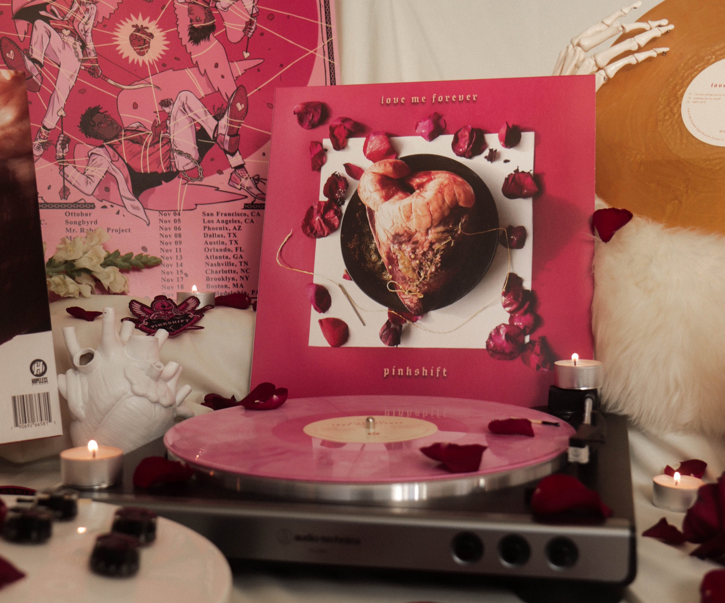
Final Vinyl Cover (Front & Back)
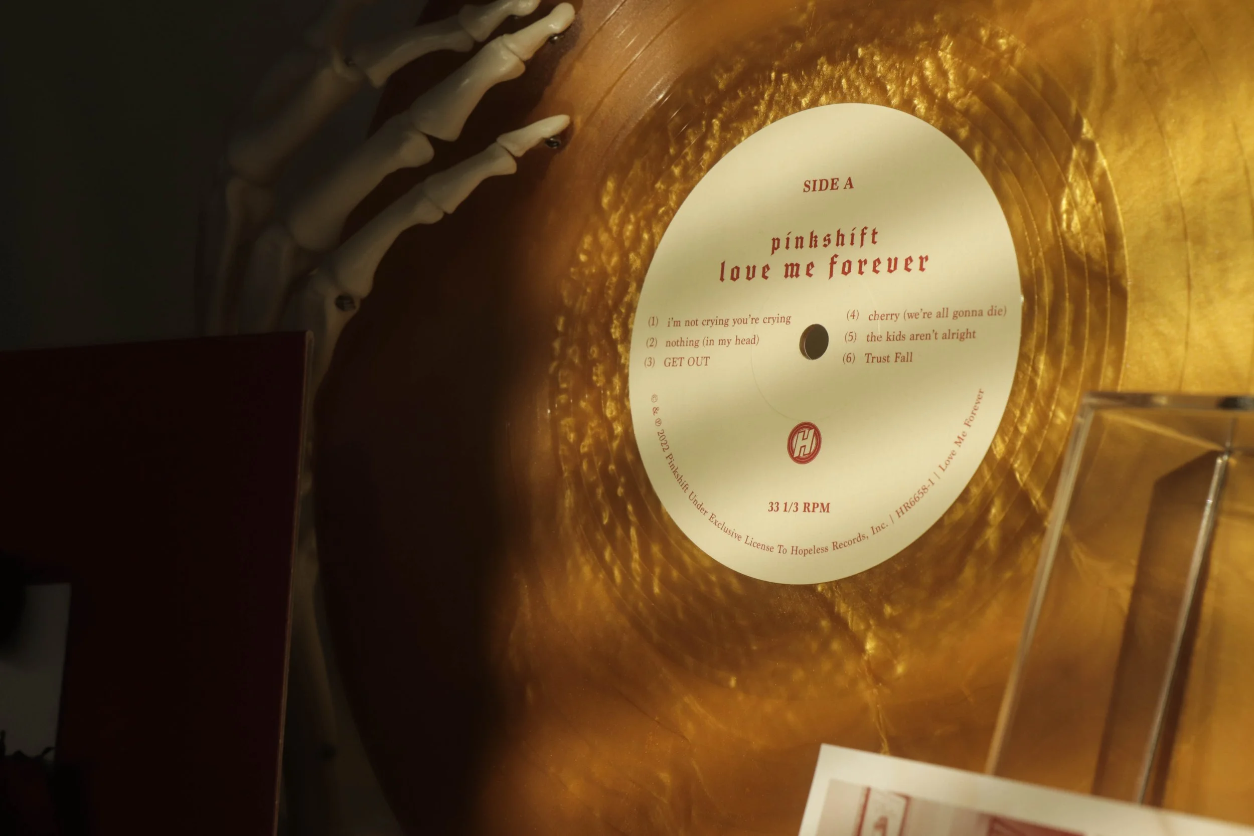
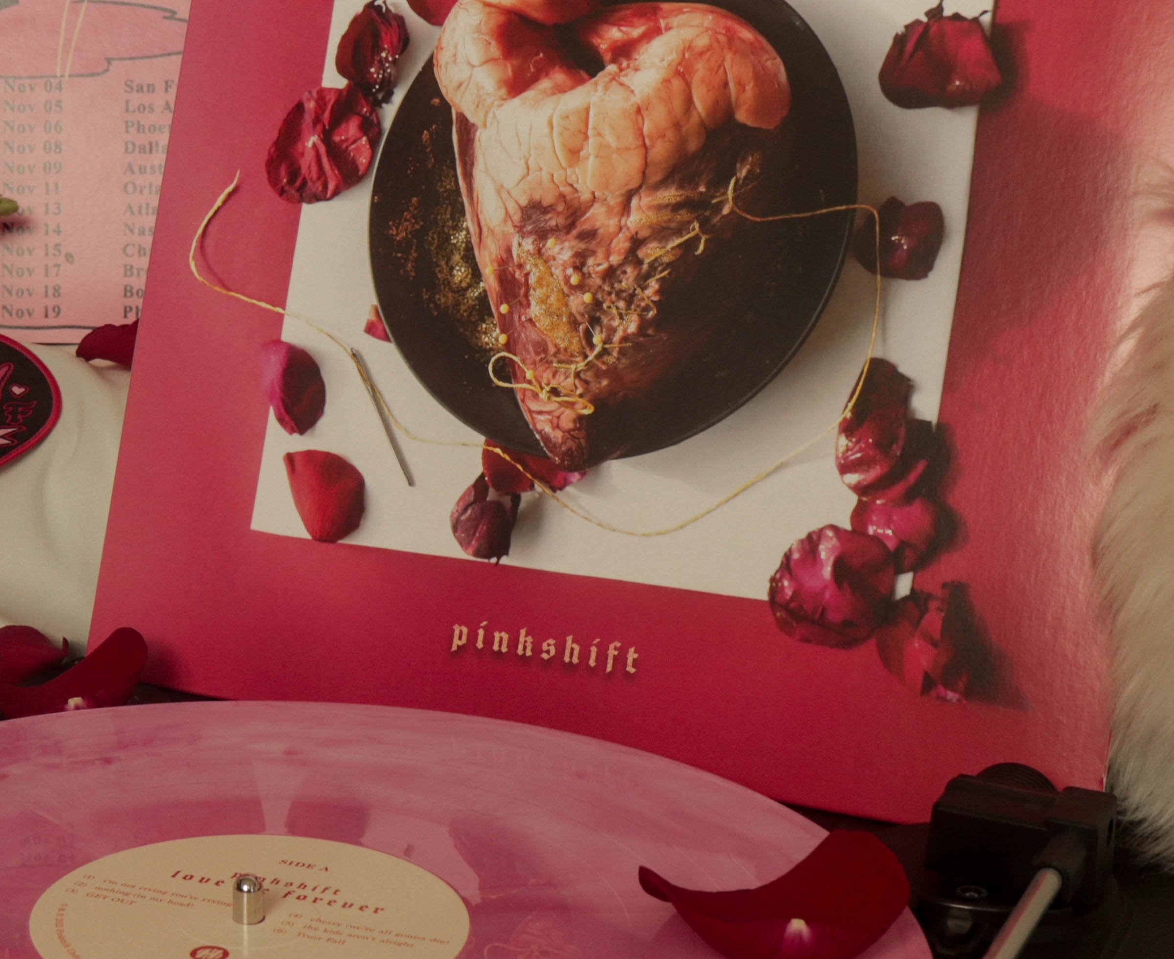
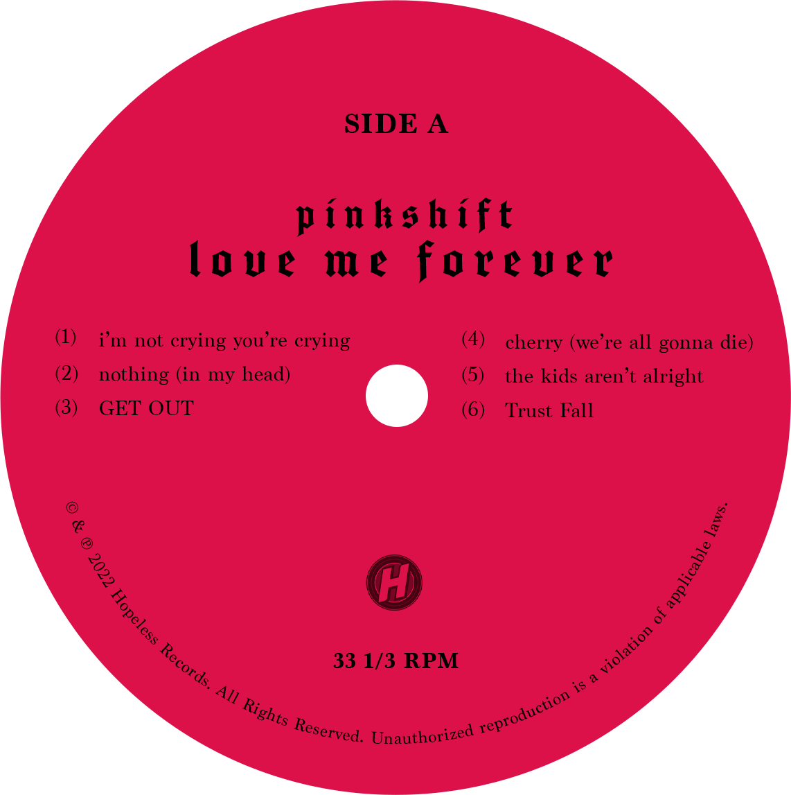
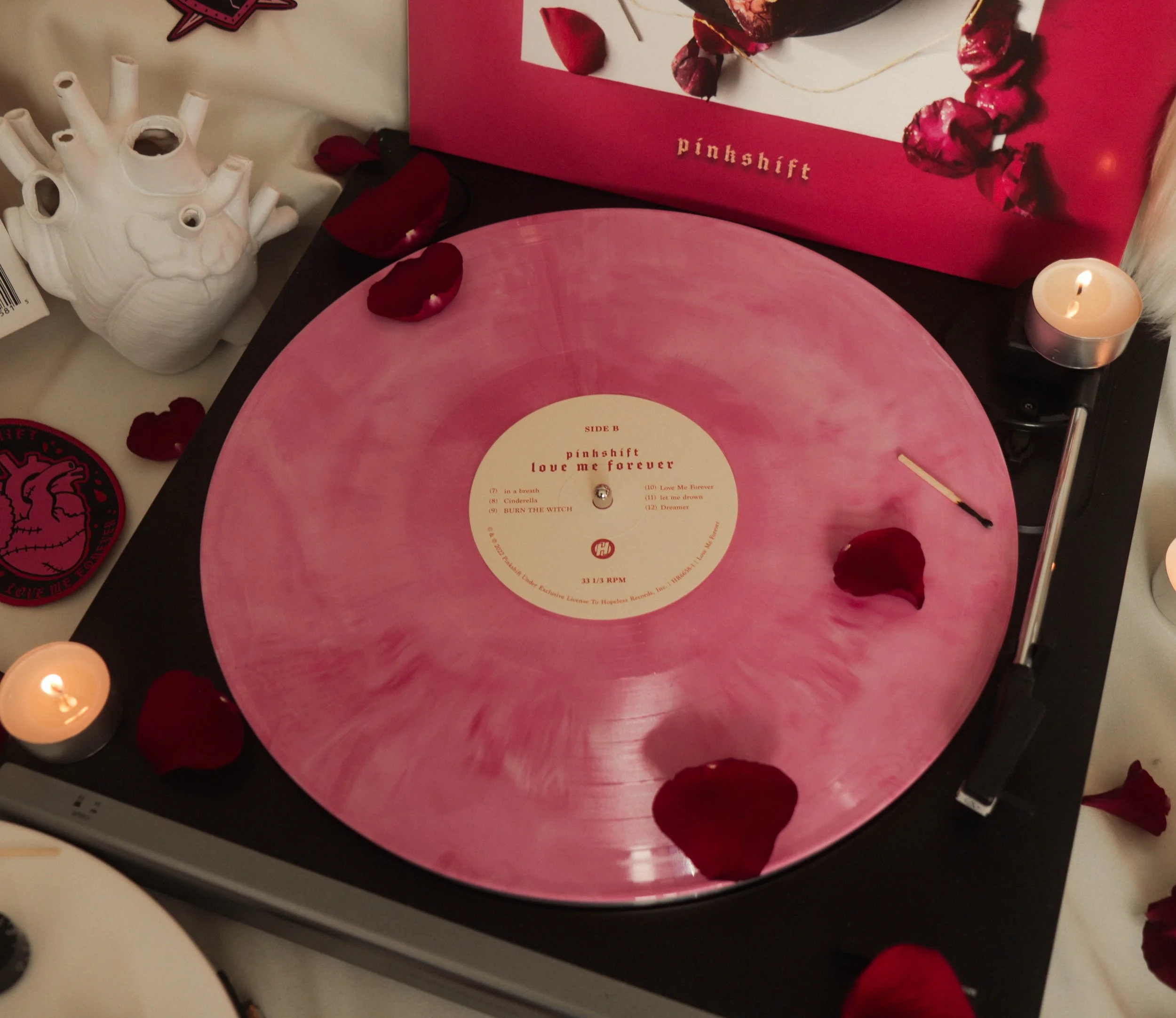
The Vinyl Stamps
Once the cover was finalized, we moved into the other pieces of the vinyl packaging: the stamps, and insert. During the ideation process, we deliberated about carrying over the photography into the stamps themselves, but through this process discovered that their needed to be a break in photo use.
Given that the covers and the insert were so graphically heavy, the stamp acted as a contrasting element when viewing the full set of packaging assets as a set.
Process Sketches for Vinyl Stamp Layout
Color Variants for Final Stamp Layout
Vinyl Stamp (Side A Gold Variant)
Vinyl Stamp (Side B Pink Candy Variant)
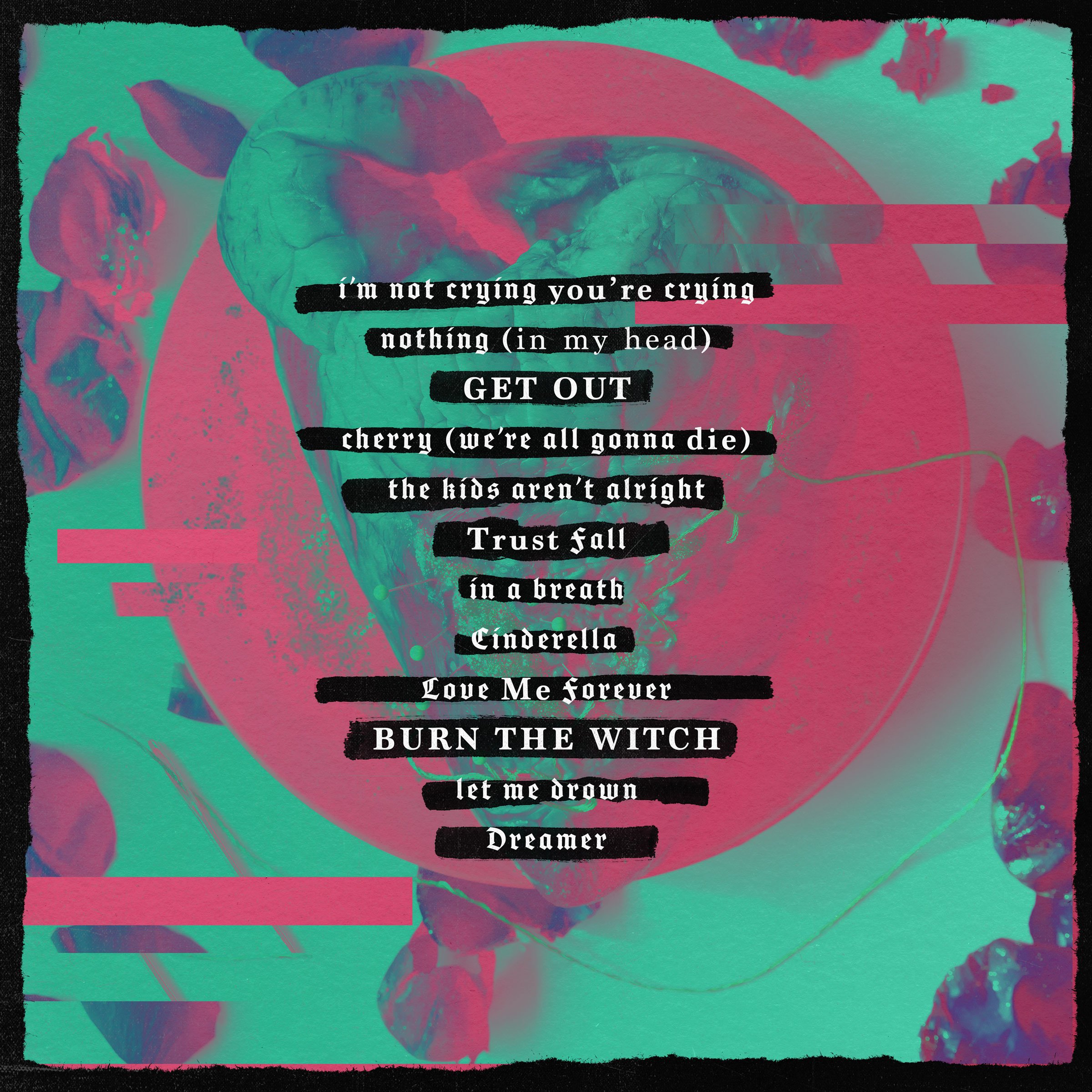
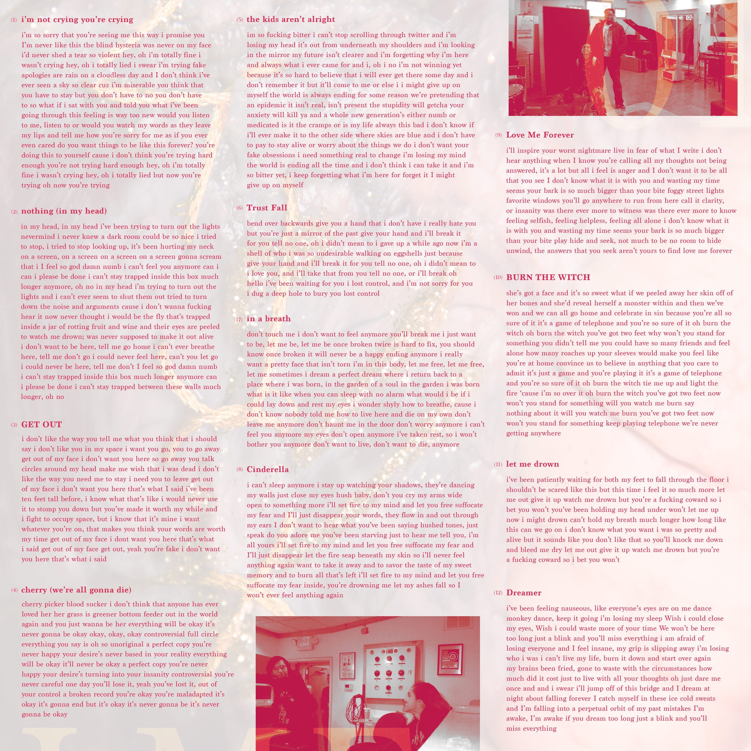
The Vinyl Insert
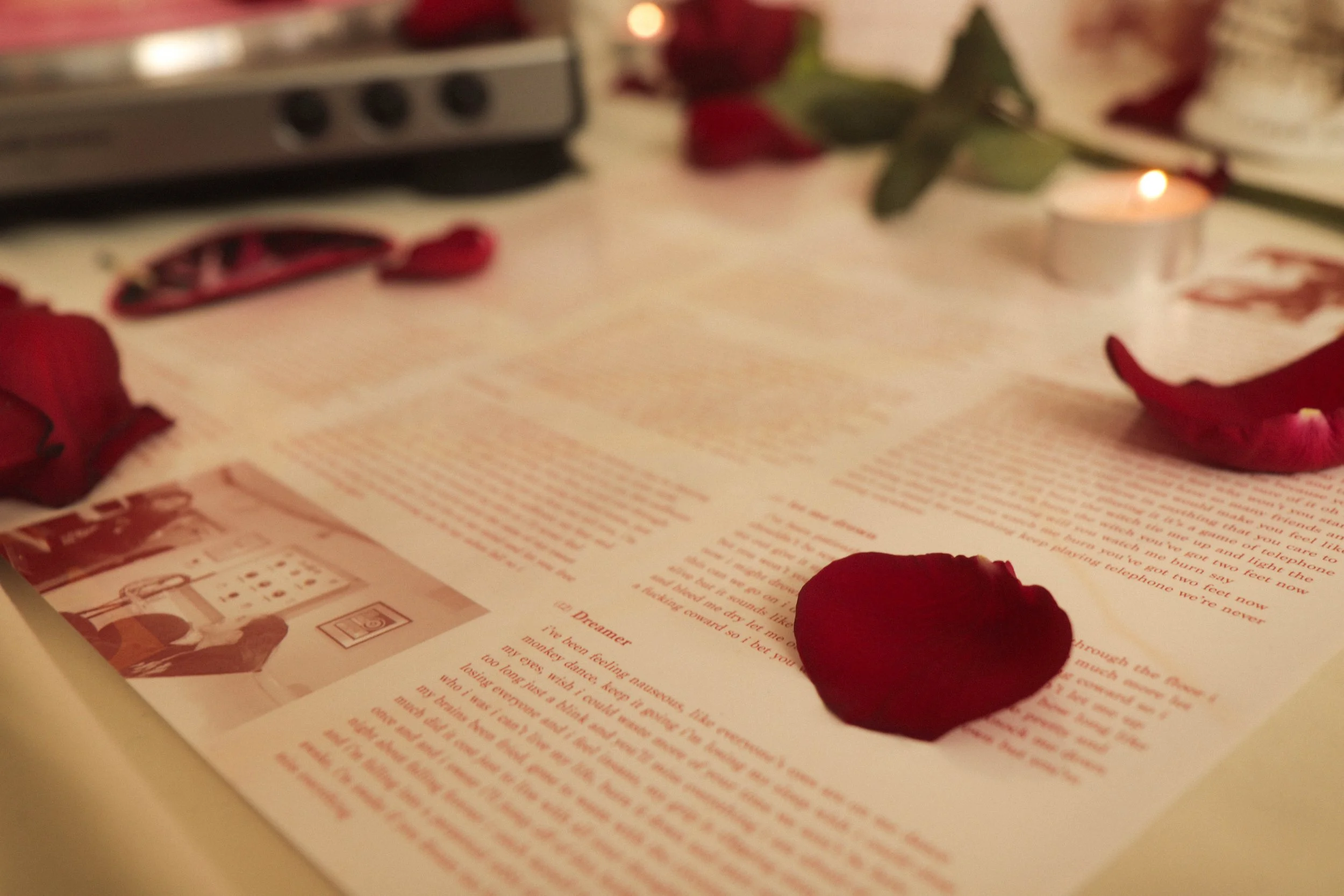
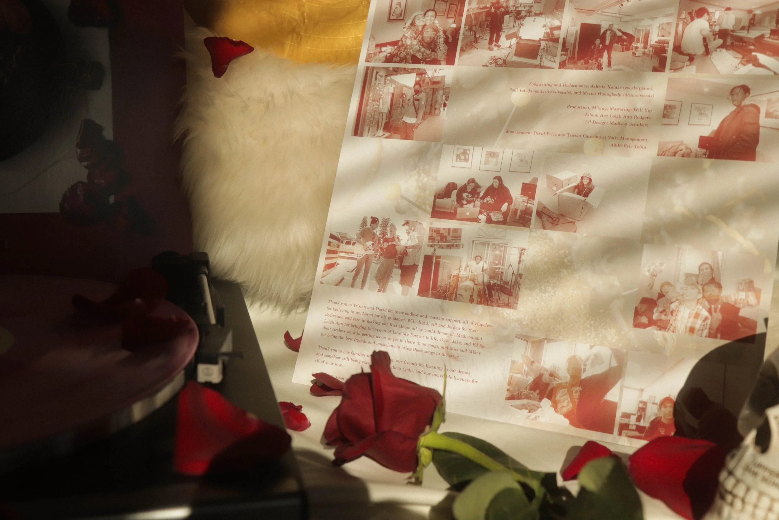
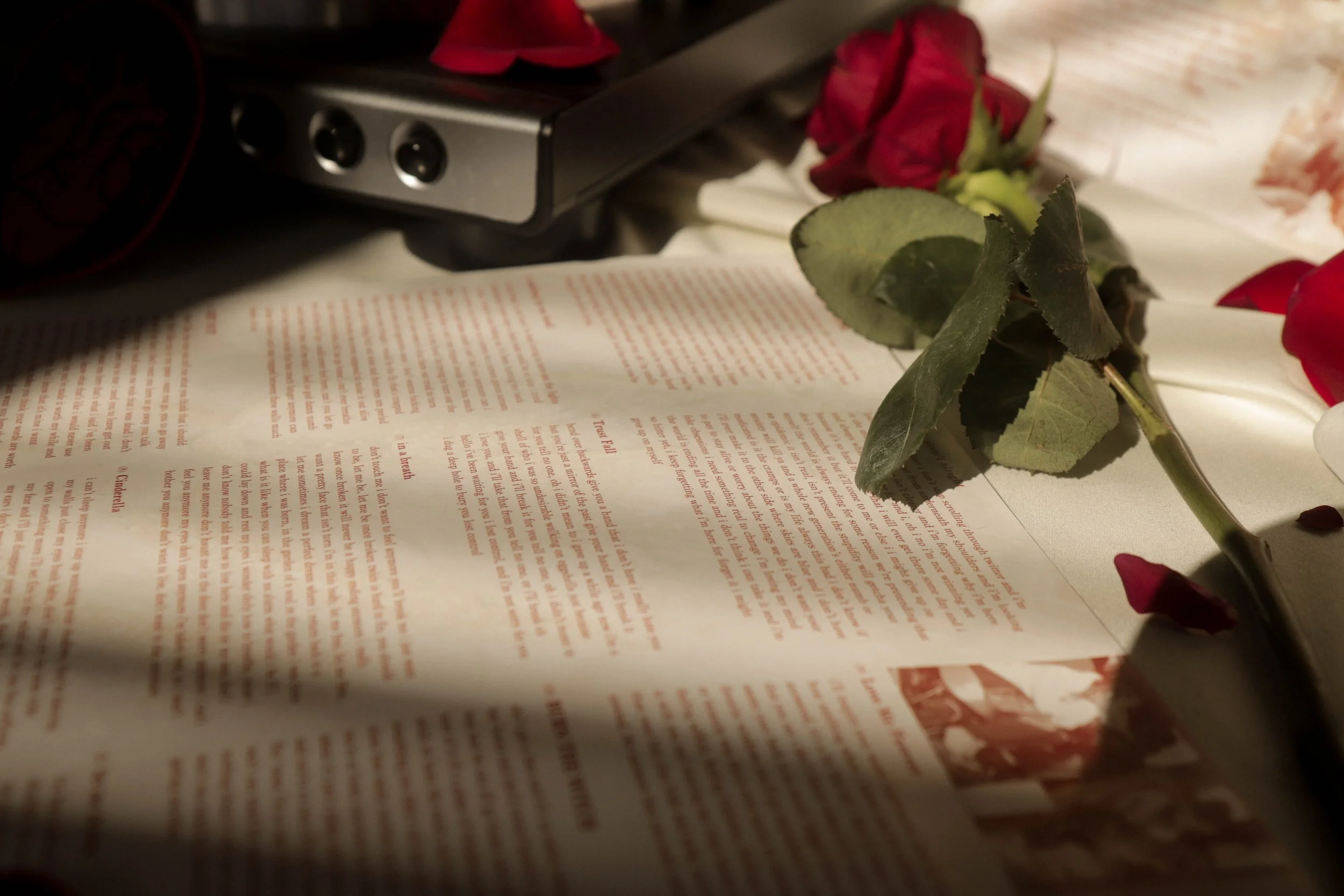
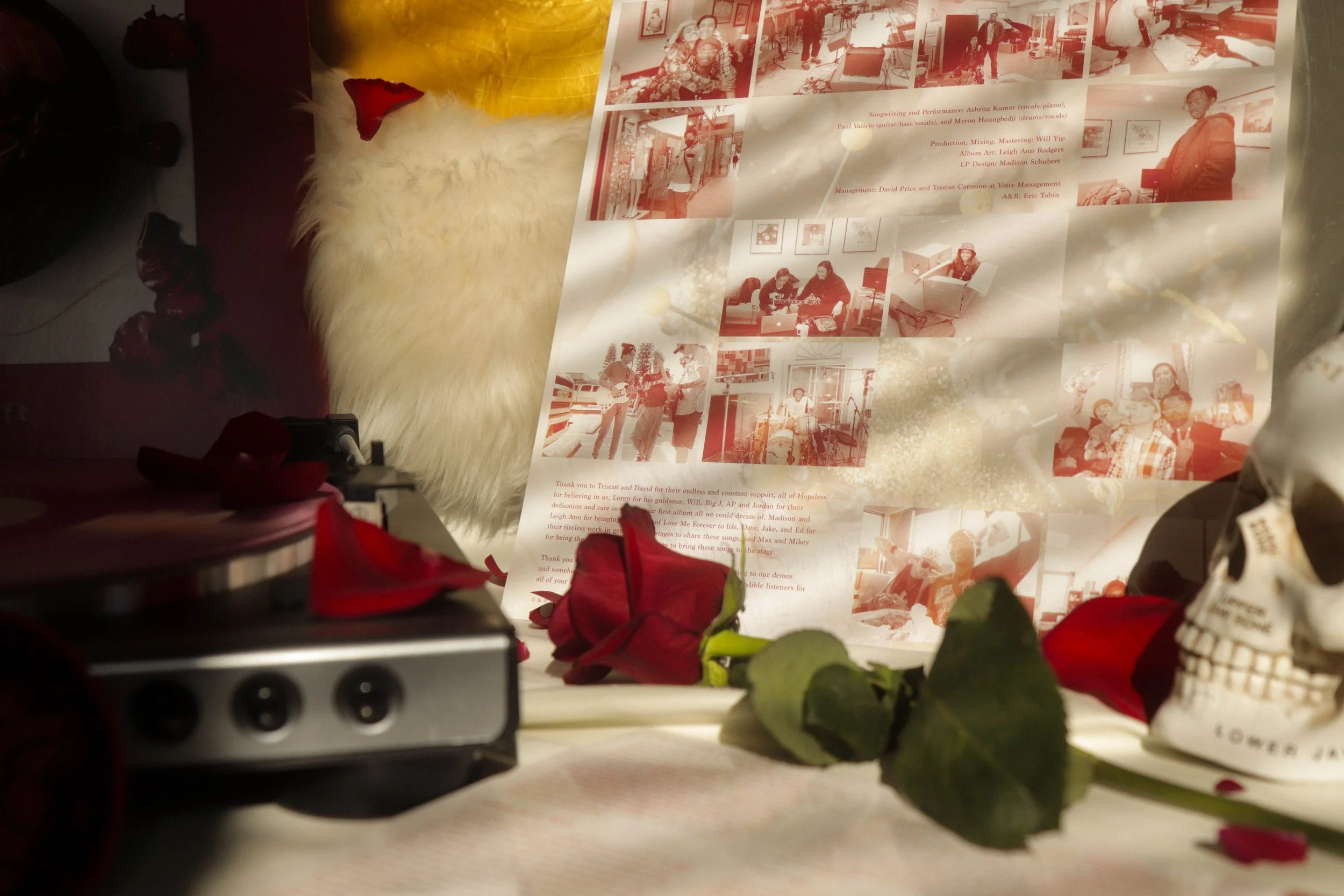
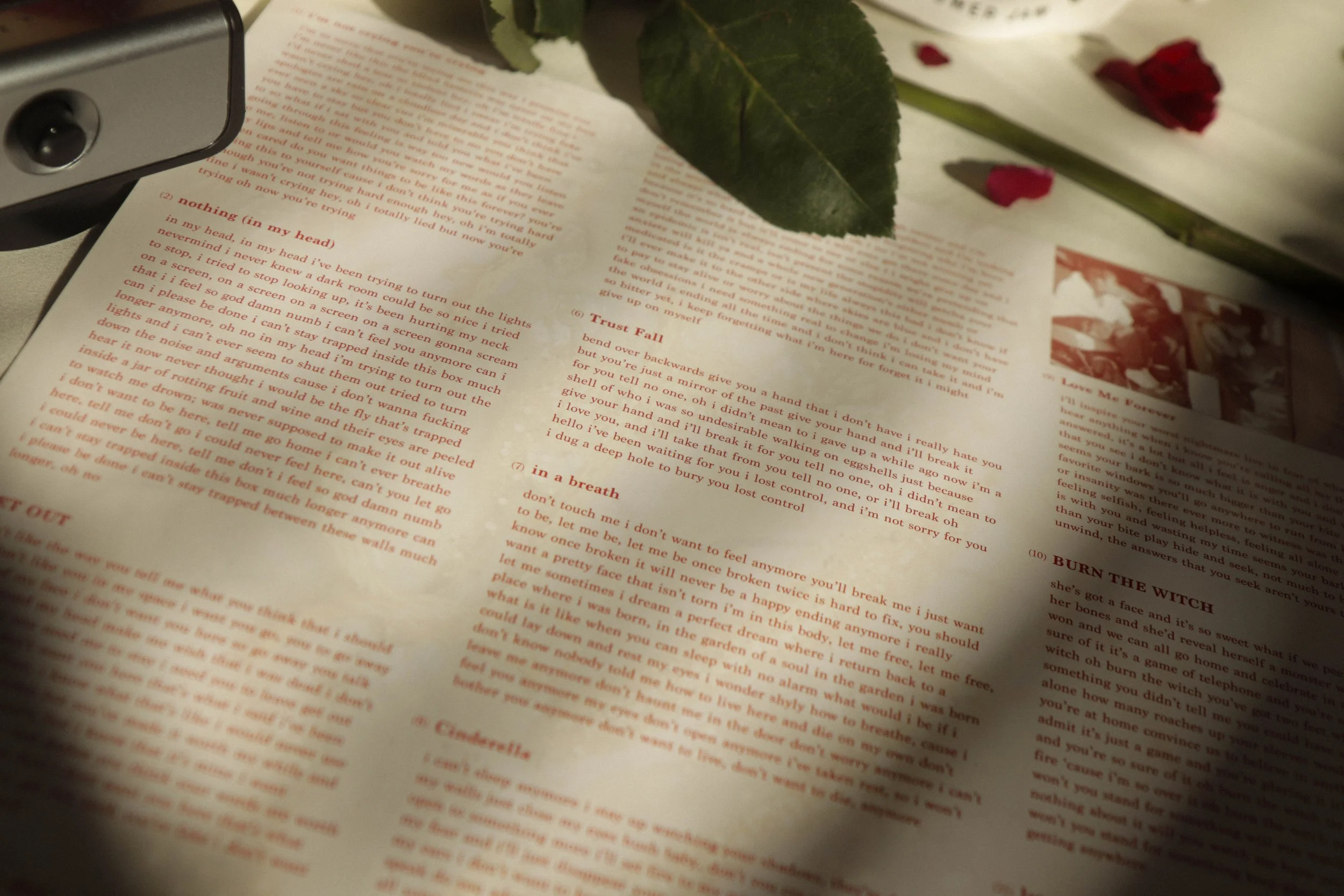
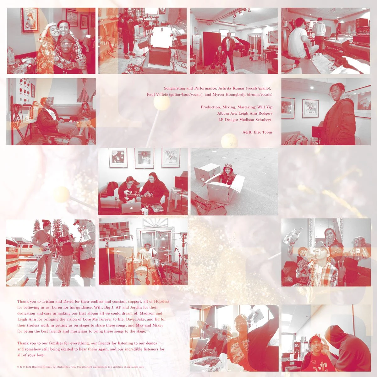
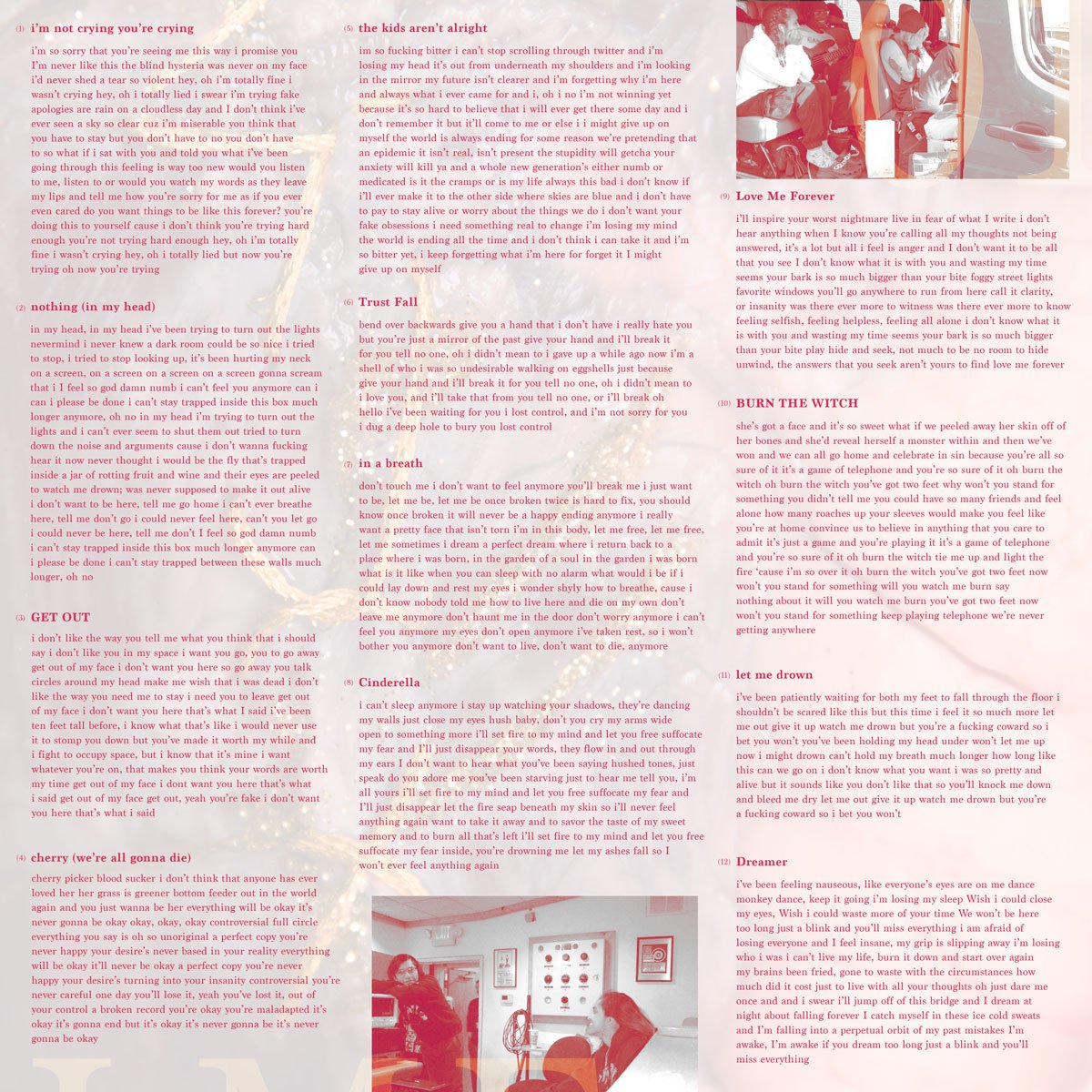
During the initial sketch process of the vinyl insert, the band requested a number of elements to be added to the layout including: production photography, credits, lyrics, and some photo treatments discovered during the vinyl sleeve phase of the design process.
With this in mind, I sketched out a collection of layout concepts which then carried into rough digital design to get feedback from the band. At the end of this process, the band decided they wanted a more asymmetrical photo layout that felt a bit chaotic in placement while also fitting to the established minimalist approach of the other deliverables.
Layout sketches for Vinyl Insert
Color Variant Options for Final Insert Layout
Detail shot of lyric page
Final Vinyl Insert (Front)
While the final variant that was chosen was the red, I also spent some time mixing and matching vinyl stamp colors with insert colors so the packaging worked as a whole while also implementing band input on how they envisioned the final set when viewed collectively.
Final Vinyl Insert (Back)
The CD
Packaging
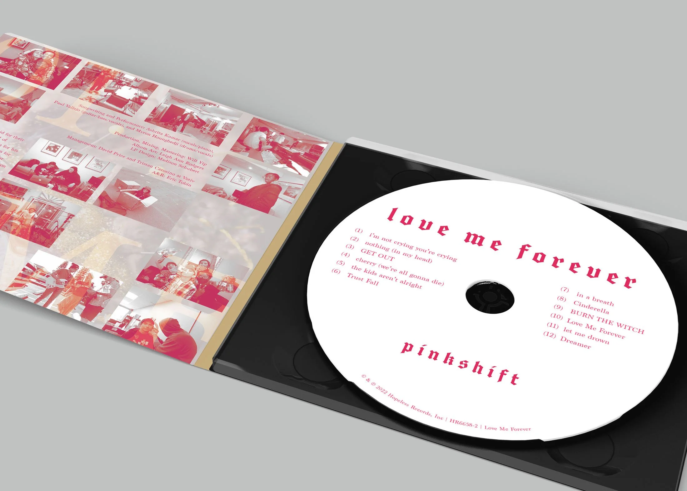
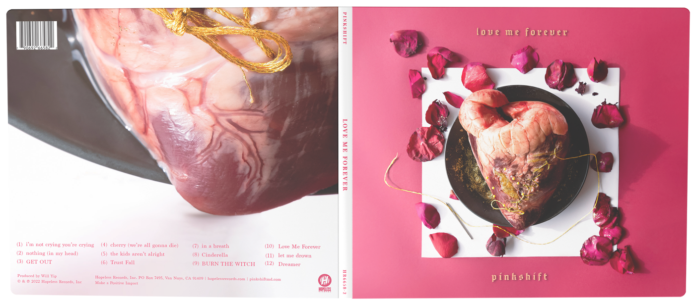
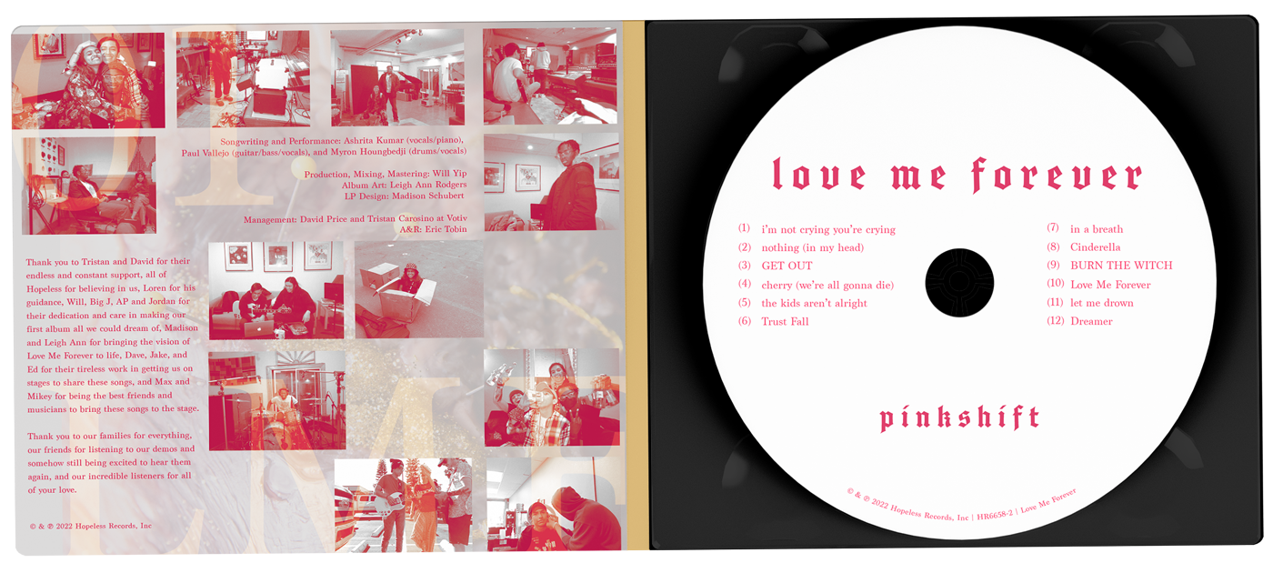
The CD packaging fell in line with the established designs of the vinyl. The layouts and assets from the vinyl process carried over to the CD and was adapted for digipak formatting so the duo deliverables works together as a set.
CD Packaging Mockup (Exterior)
CD Packaging Mockup (Interior)
Final CD Design (Exterior)
Final CD Design (Interior)
The Tour Admat
& Crew Badge
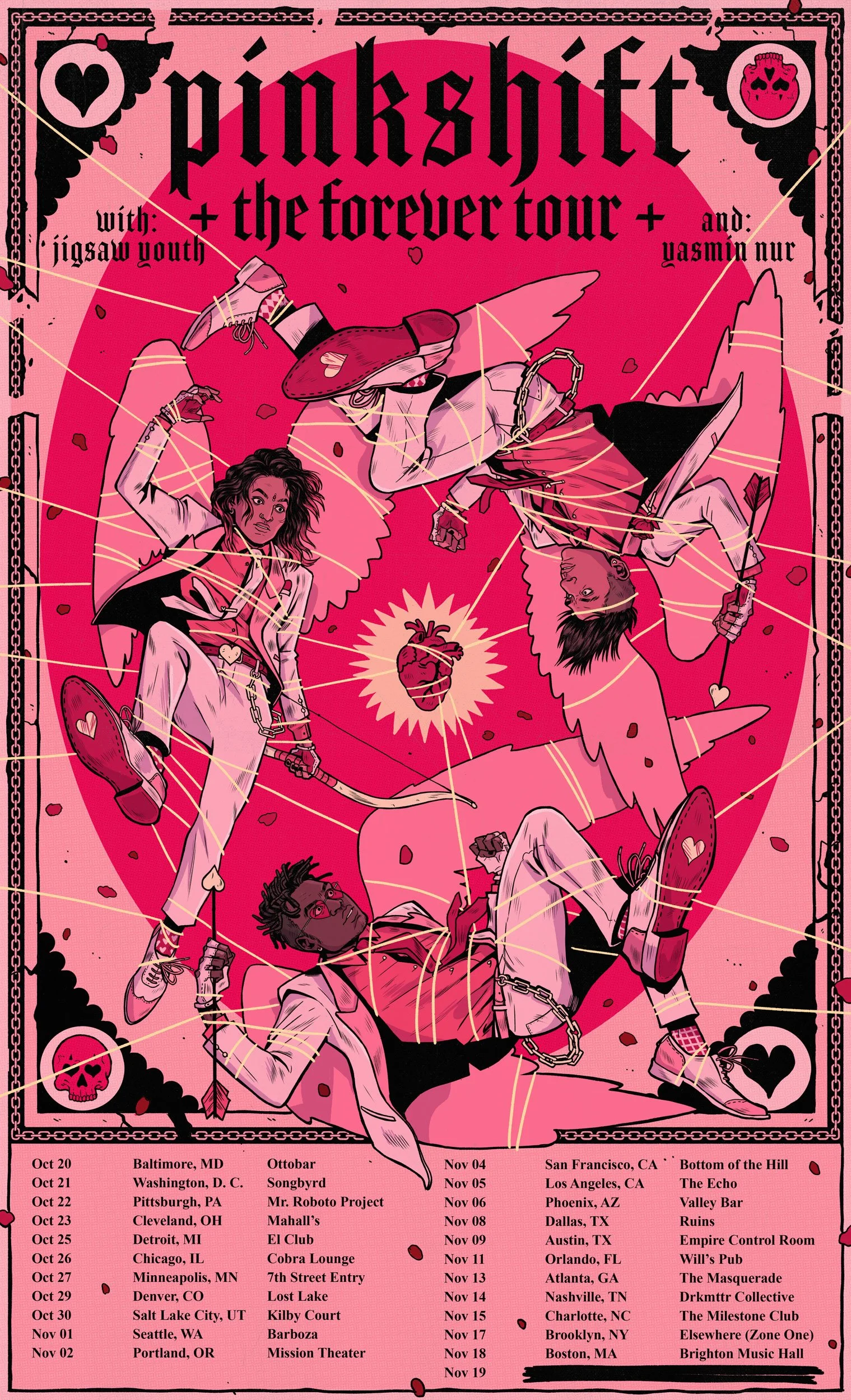
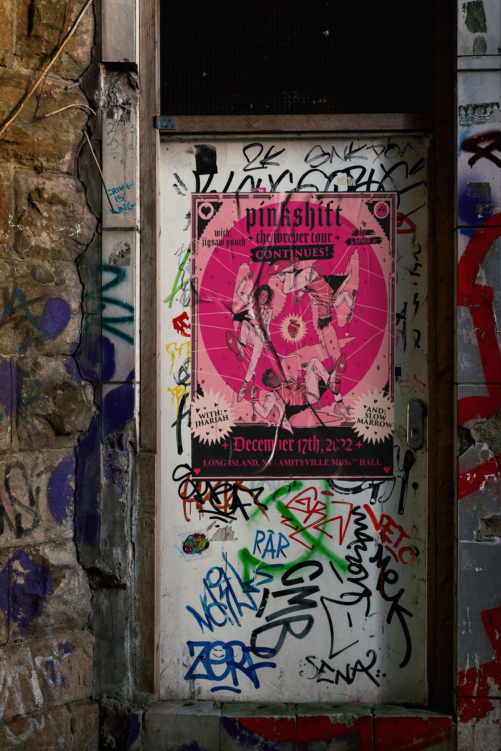
The tour poster was a fun departure from the heavy photo/graphical nature of the record packaging. The band still wanted the poster to fall in line with the tone of the album cover but allowed some artistic liberty for the overall concept.
Based on this, I illustrated the band as a trio of cupid-style angels with the centerpiece being the heart from the album cover.
Full Tour Admat (Long Version)
This concept ended up being carried through to an animated music video and led to some active fan engagement where some fans recreated the outfits to wear to shows.
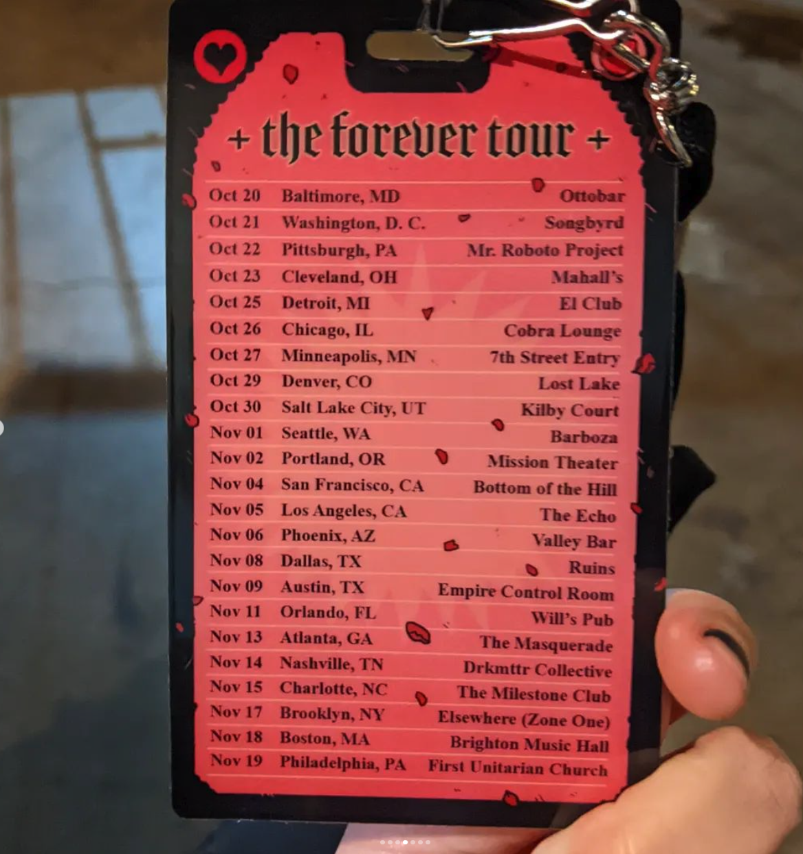
Tour Badge for Band & Crew (Back)
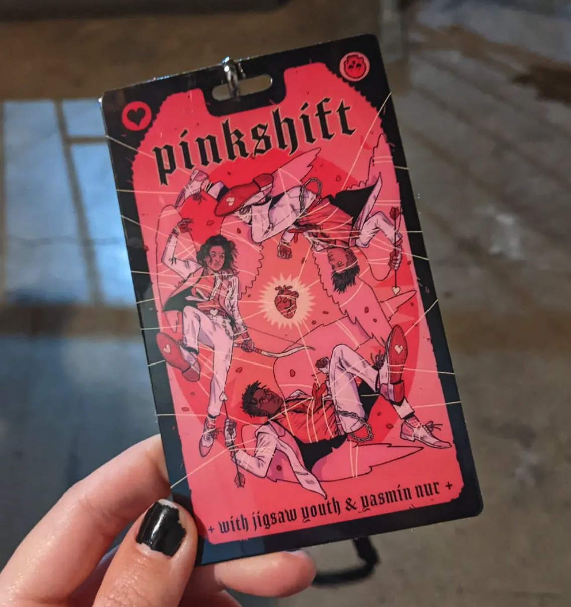
Tour Badge for Band & Crew (Front)
The
Merchandise
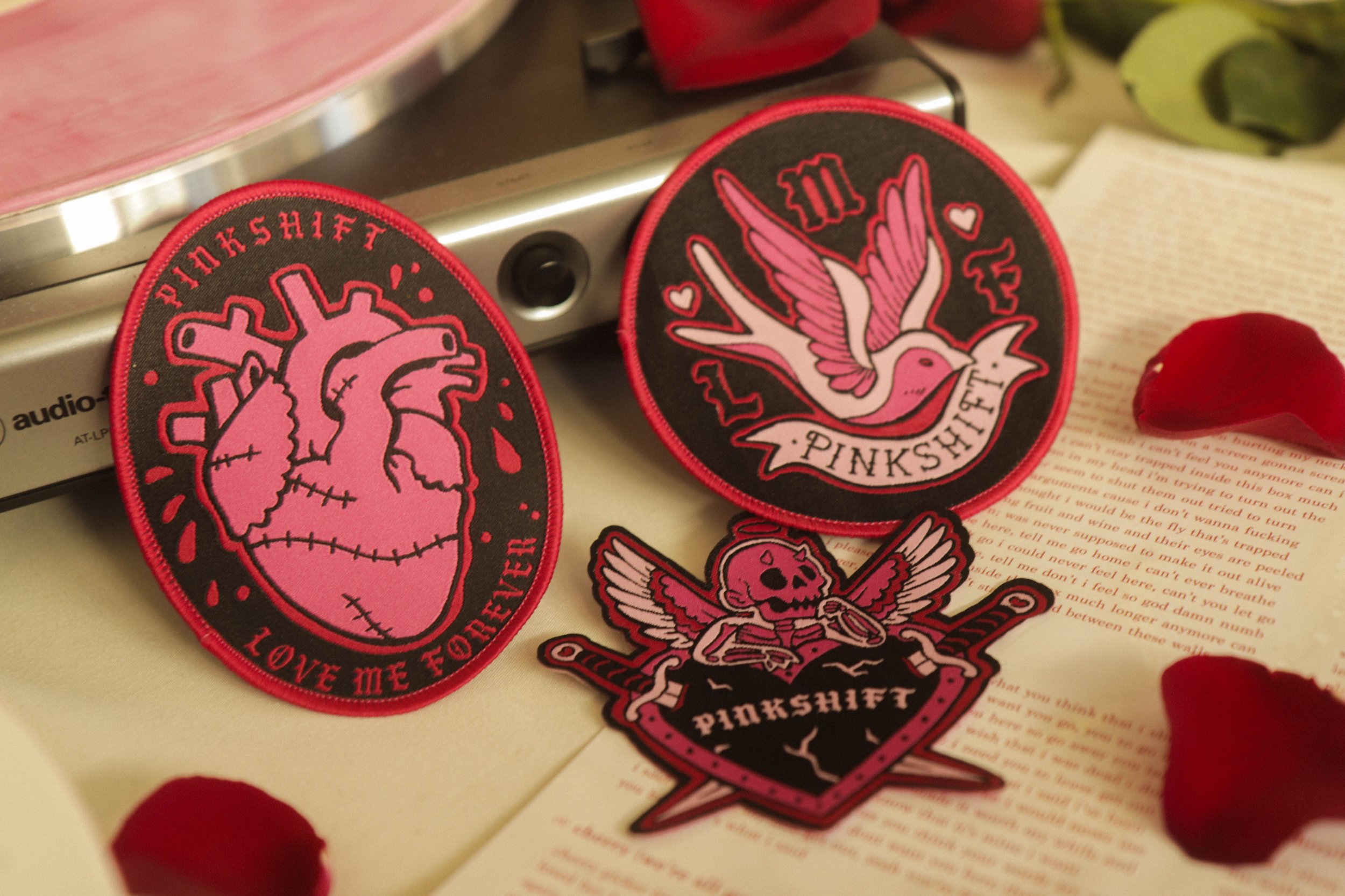
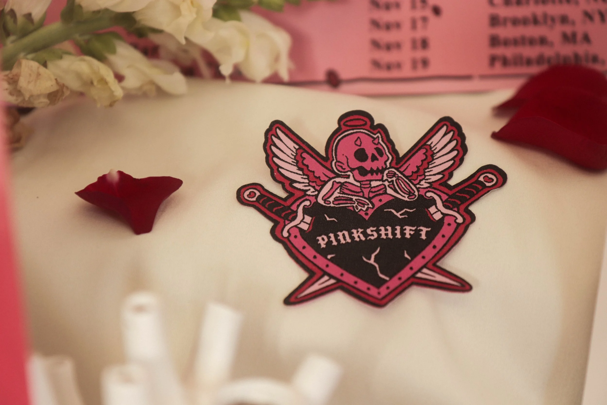
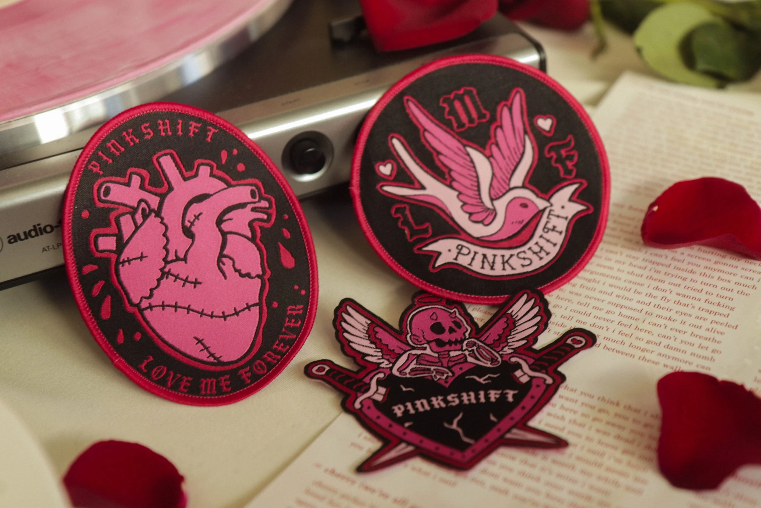
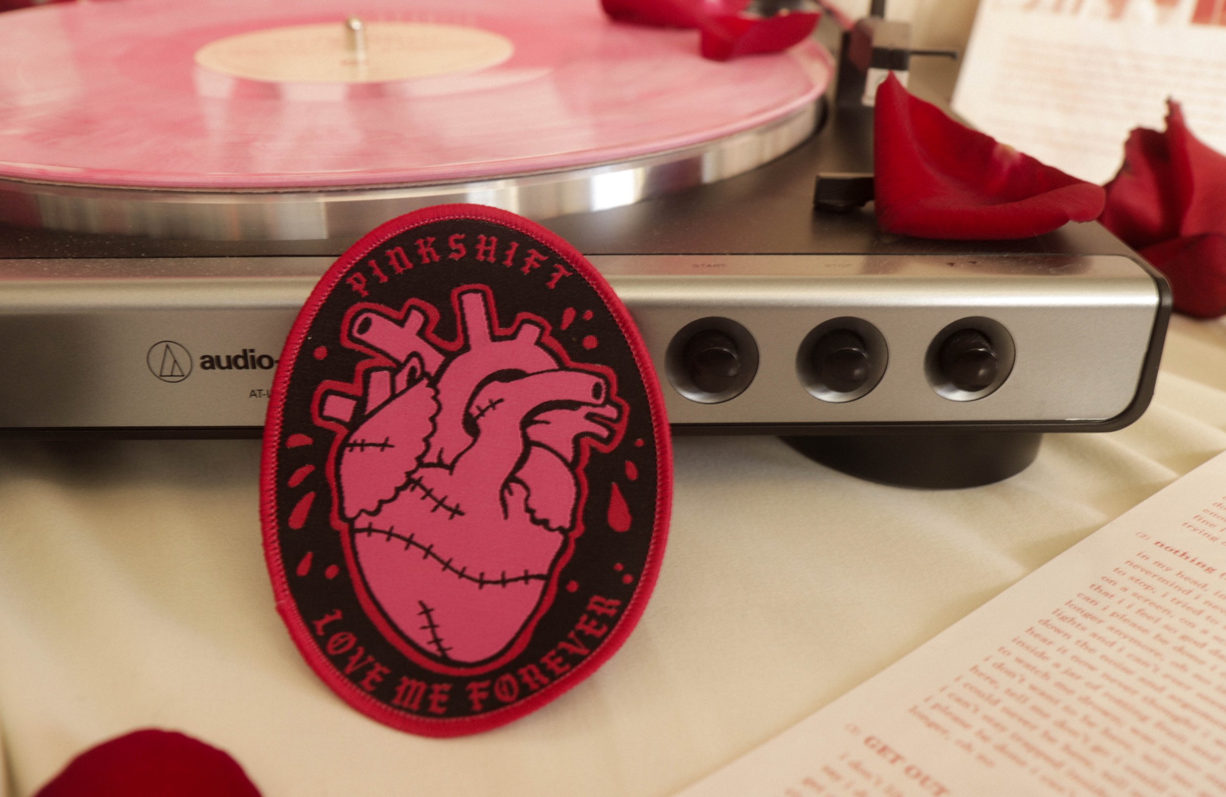
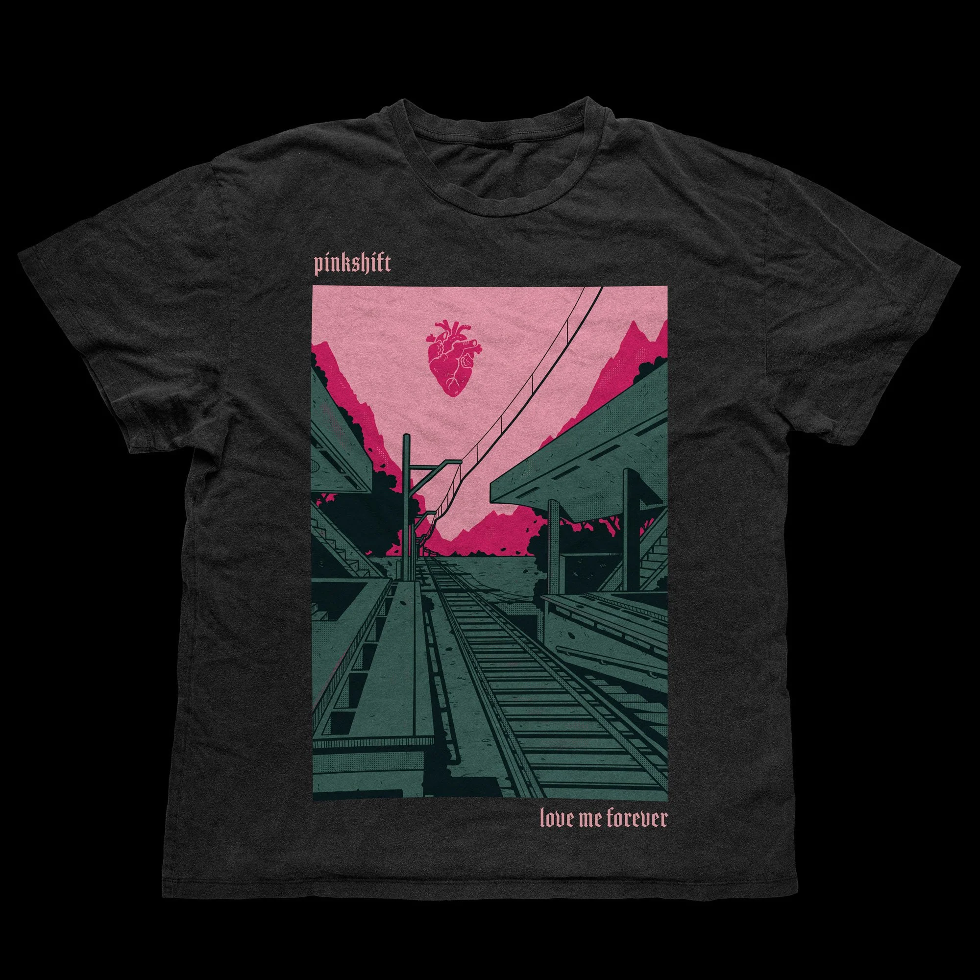
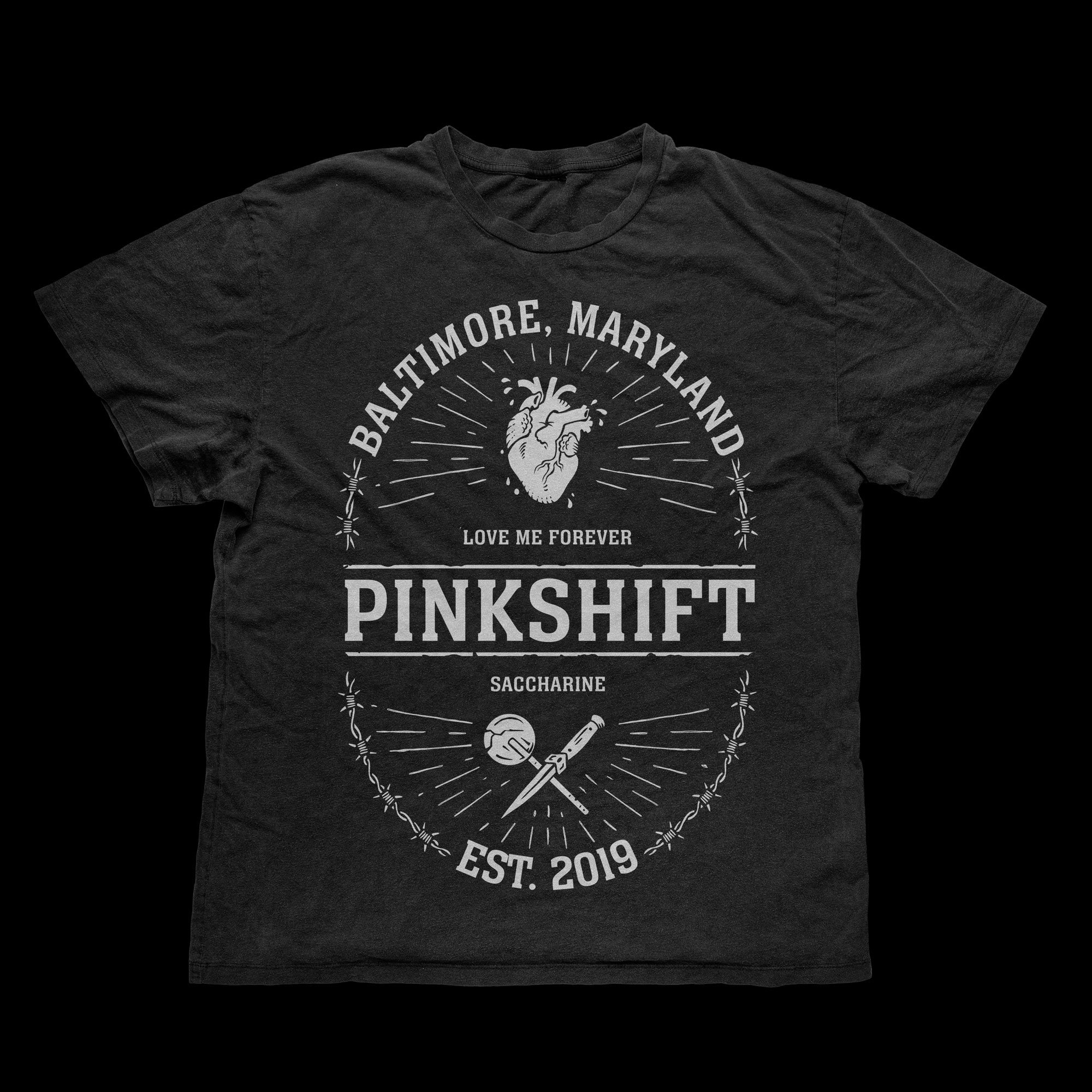
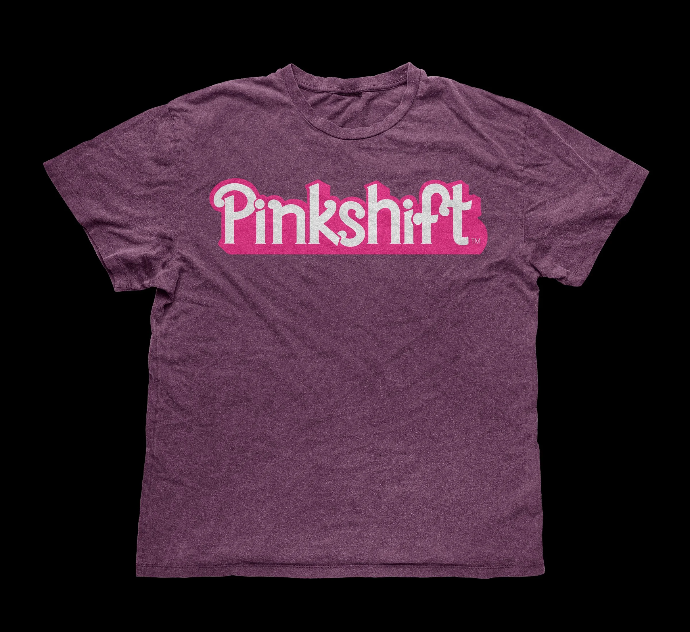
Outside the album packaging, I was also asked to create a number of merch pieces for the album cycle. This included t-shirt designs, hoodies, and patches.
These were more one-off concepts that the band specifically had in mind to translate to merchandise.Additionally the tour poster was formatted for a limited print run that the band could sell at their tour merch table.
Love Me Forever Patch Trio
Tour poster (Venue Variants)
2022 Album Launch Design (T-Shirt Variant)
2022 American Tour Exclusive T-Shirt Design
2023 Europe Tour Exclusive T-Shirt Design
The Album Rollout
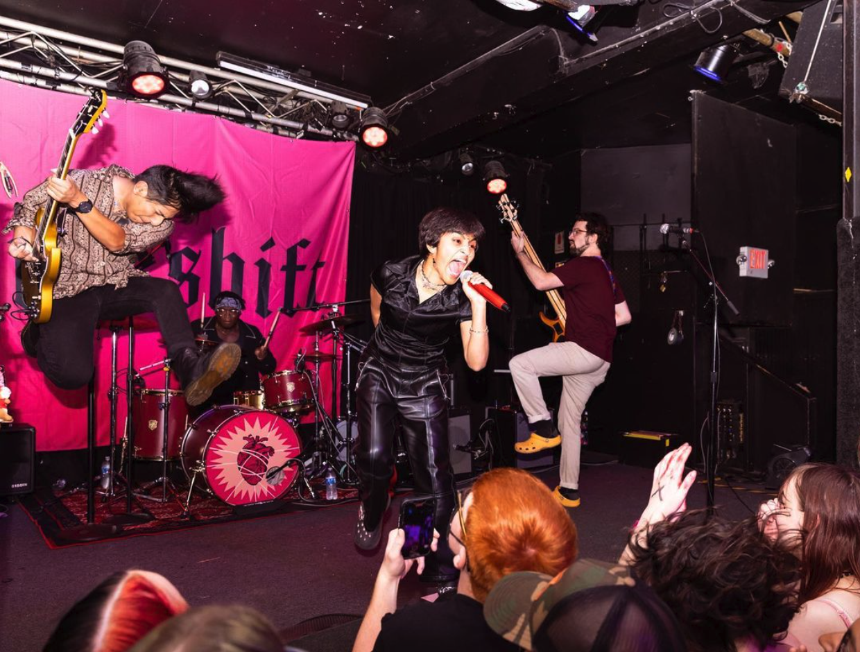
The album was rolled out in October 2022, along with a subsequent headliner tour announcement for the remainder of the fall season. Throughout this time, I crafted additional marketing materials and deliverables for tour, including the custom drum head design showcased below.
Compared to the last album I collaborated with them on, this process involved a lot more logistical planning and design iteration given the established photography and coordinating with management and their recently acquired record label.
Overall, this project took me back to my design roots balancing minimalist design with thematic intention and offered a unique challenge in blending the soft aesthetics of the album concept while mixing in the sharpness of post-punk and hardcore music.
Album announcement on IG, October 2022
Pinkshift on tour, featuring custom drum head design by me
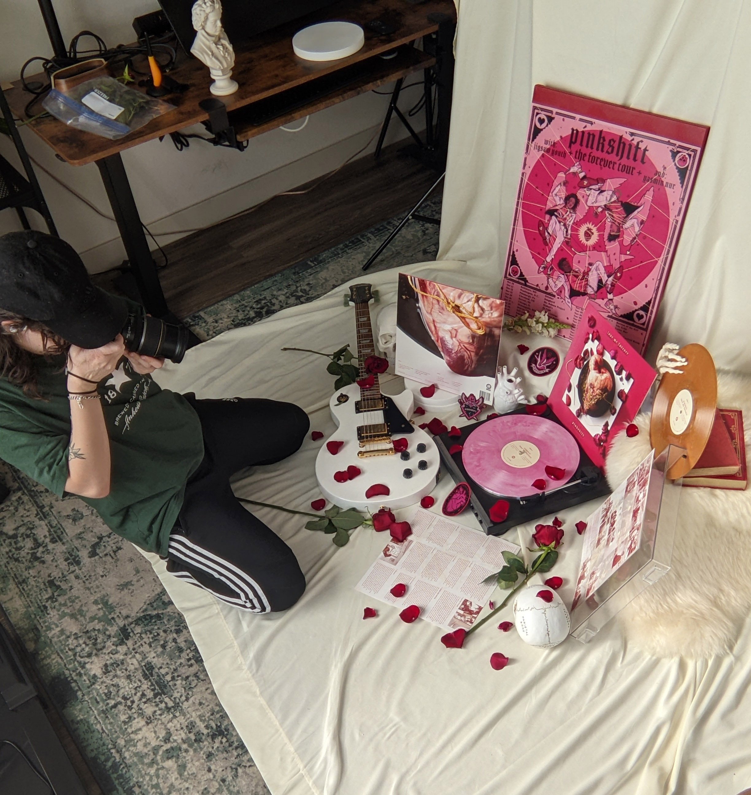
Behind the scenes on album
packaging shoot
Custom drum head illustration, expanded upon the heart idea from the tour poster design
See More Work:
