PROJECT:
New Daydream Media Branding
CLIENT:
SUMMARY:
New Daydream Media is a music label and management service, focusing on providing streamlined and hassle free music management with a focus on ease-of-use for rising and established music talent.
The NDM team originally approached me to create a brand from scratch. They had some logo concepts in mind, but the broader branding direction was left up to me and the process of brand discovery.
INDUSTRY:
Music
SCOPE:
Creative Direction, Branding
YEAR:
2022


IDEATION & DESIGN
The Start
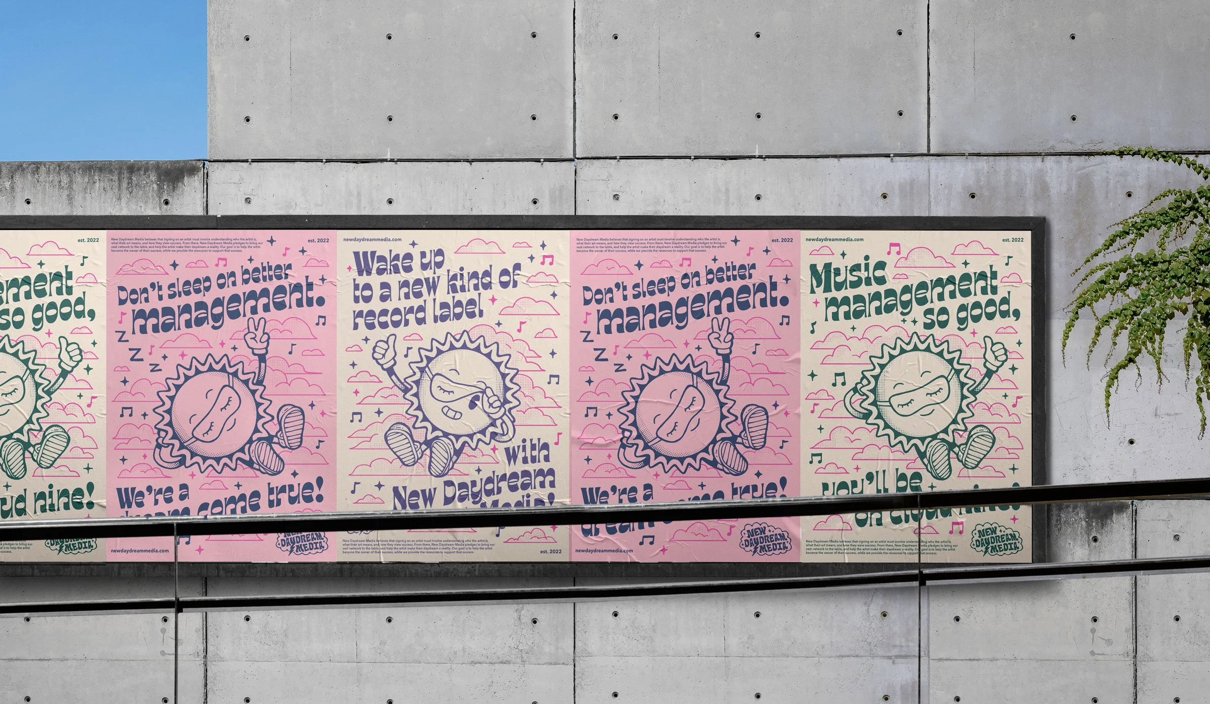
Like most branding projects, we started the process off with a discovery phase, discussing the intentions of the brand and how the team wanted to express that visually. A section of the moodboard shown below showcases the flowing letterforms and soft color palette which was meant to represent the approachable and welcoming environment that NDM wanted to bring to the music scene.


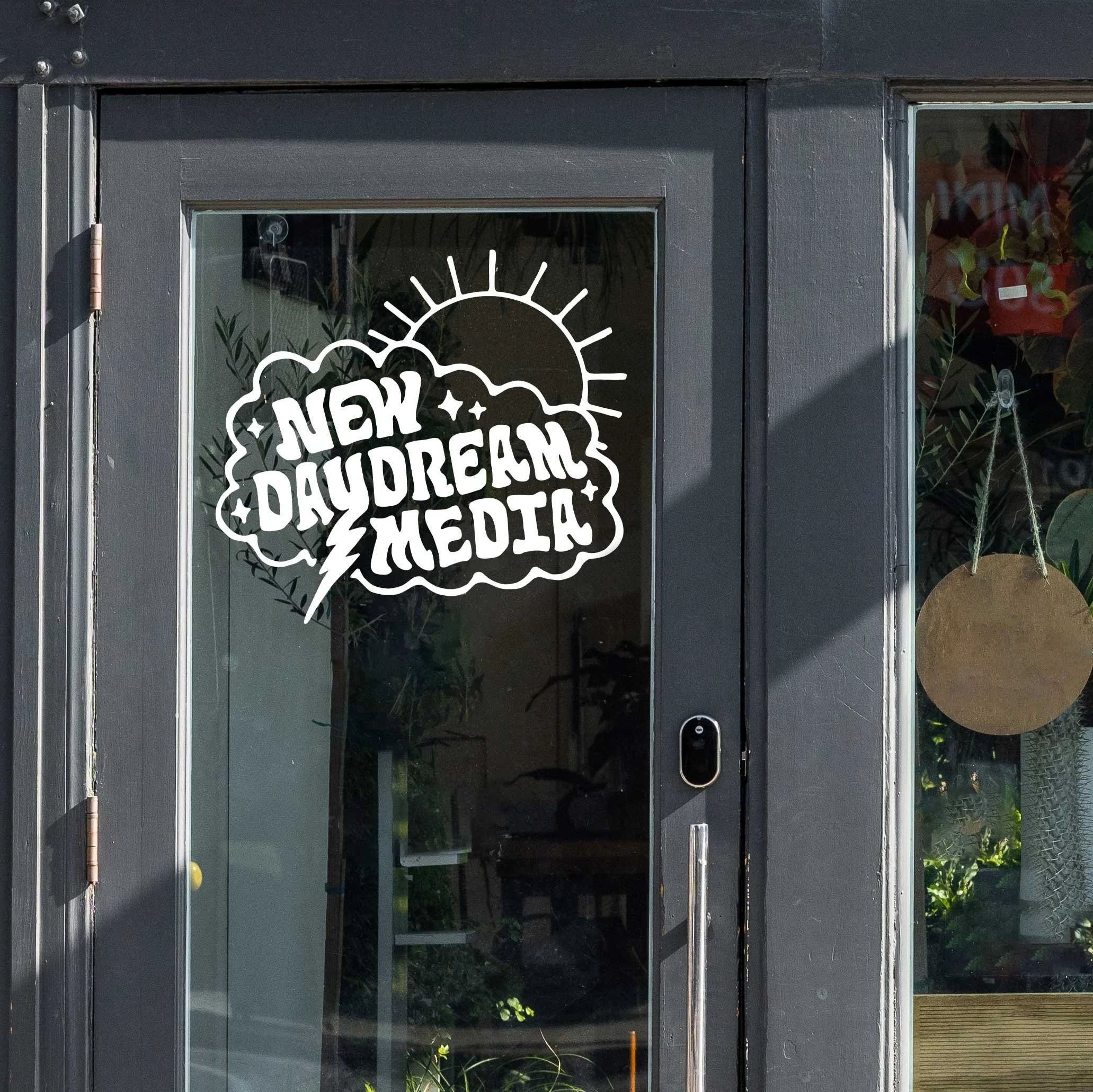
The Logo suite
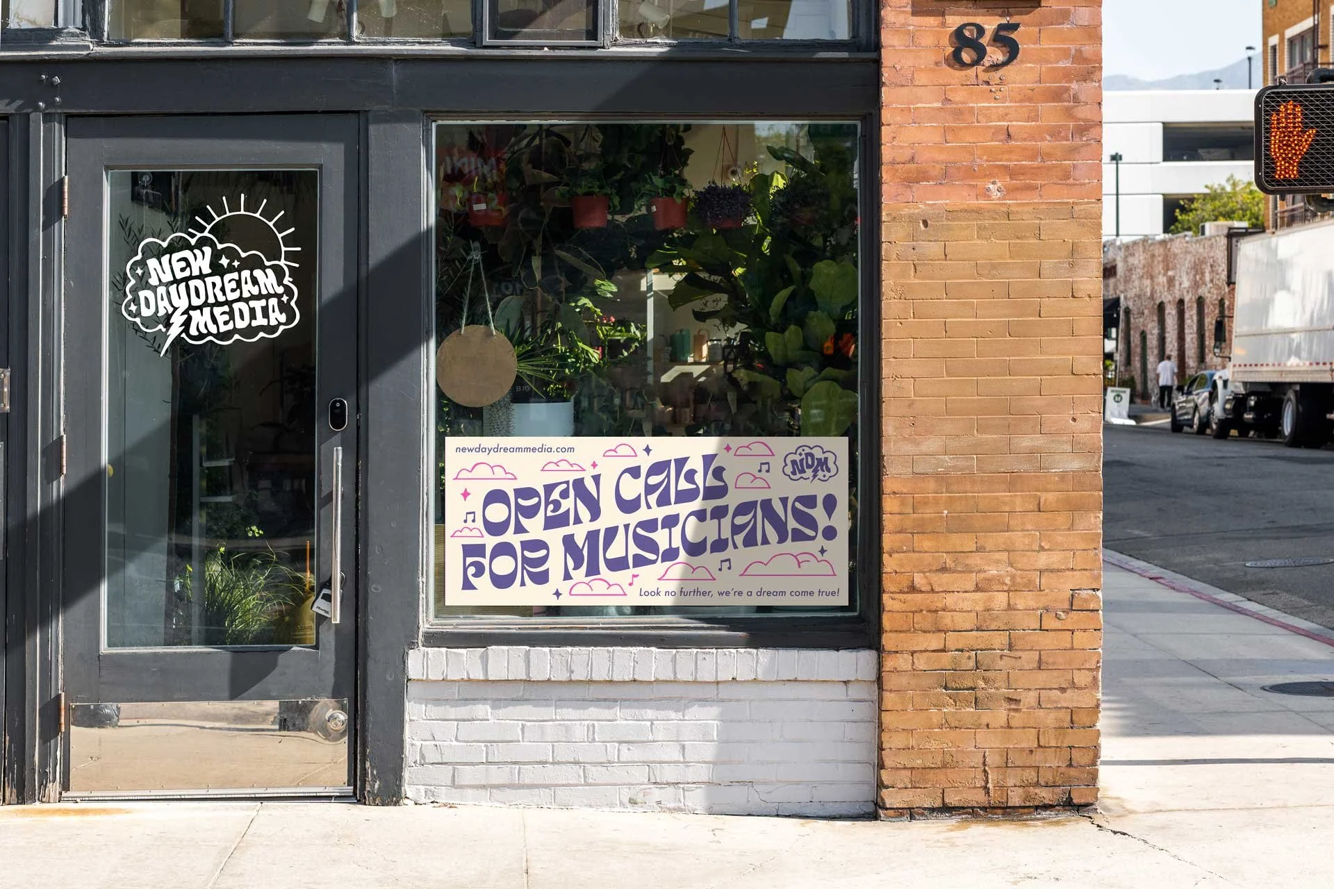
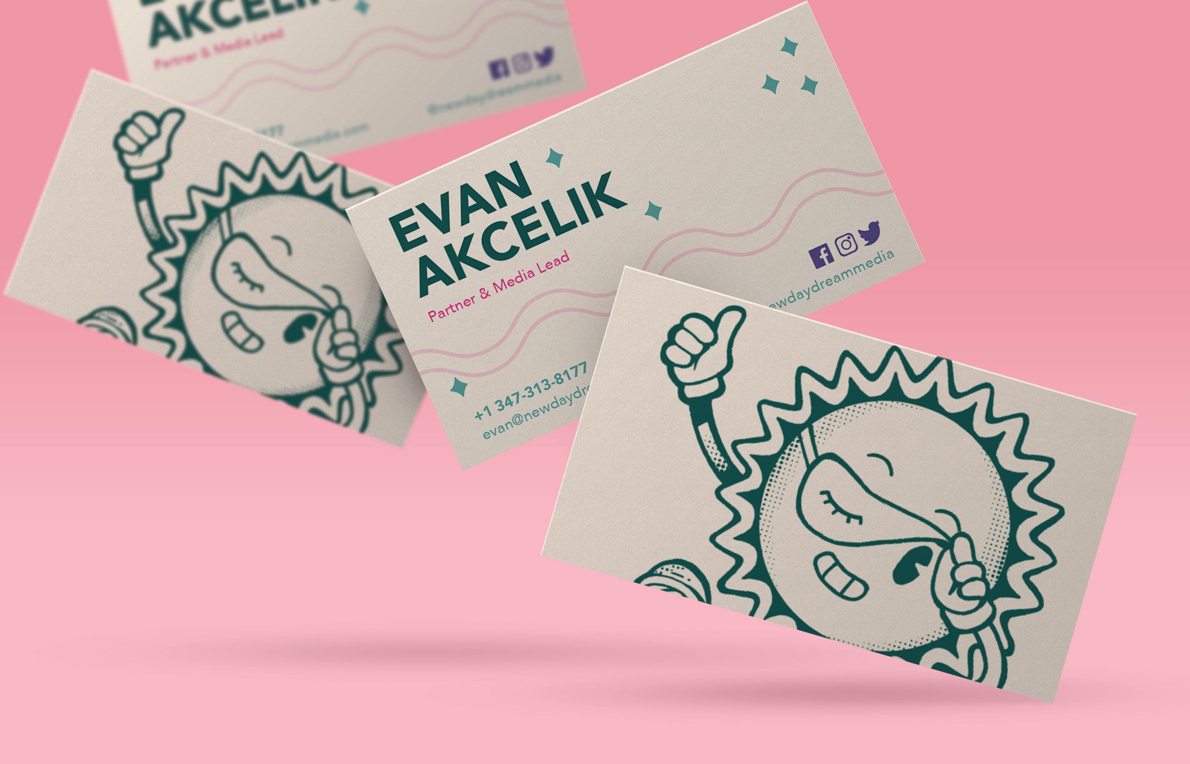
During the ideation process, the client’s focus was on variety and playfulness. We quickly settled on the concept of a mascot, which carried into the primary logo mark, but there were some additional size and style variants that were approved based on flexibility and deliverable use.
While the mascot logo would be used most often, it was important to have some other options that could pair with the full scale illustrations of the mascot so they designs didn’t compete against one another.
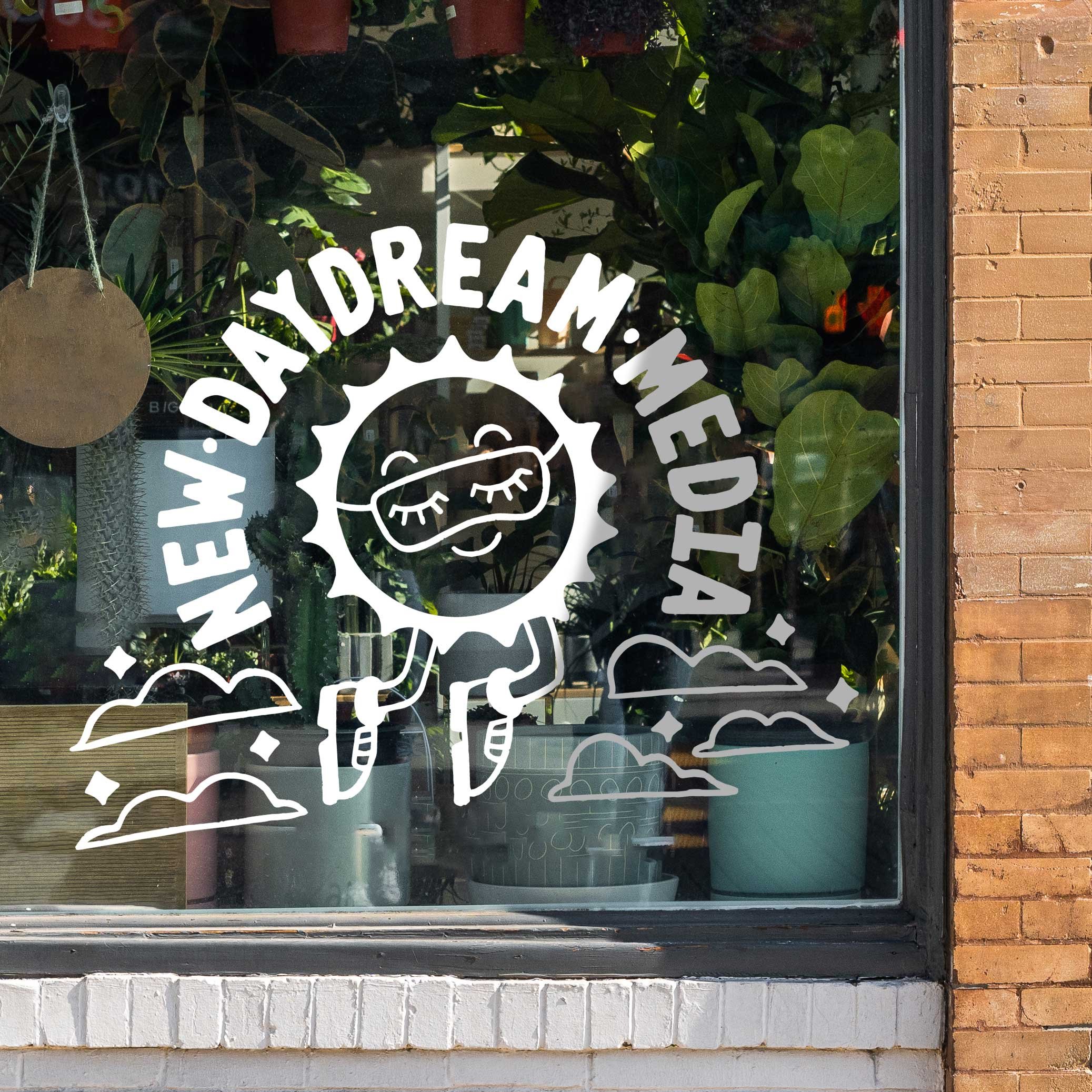
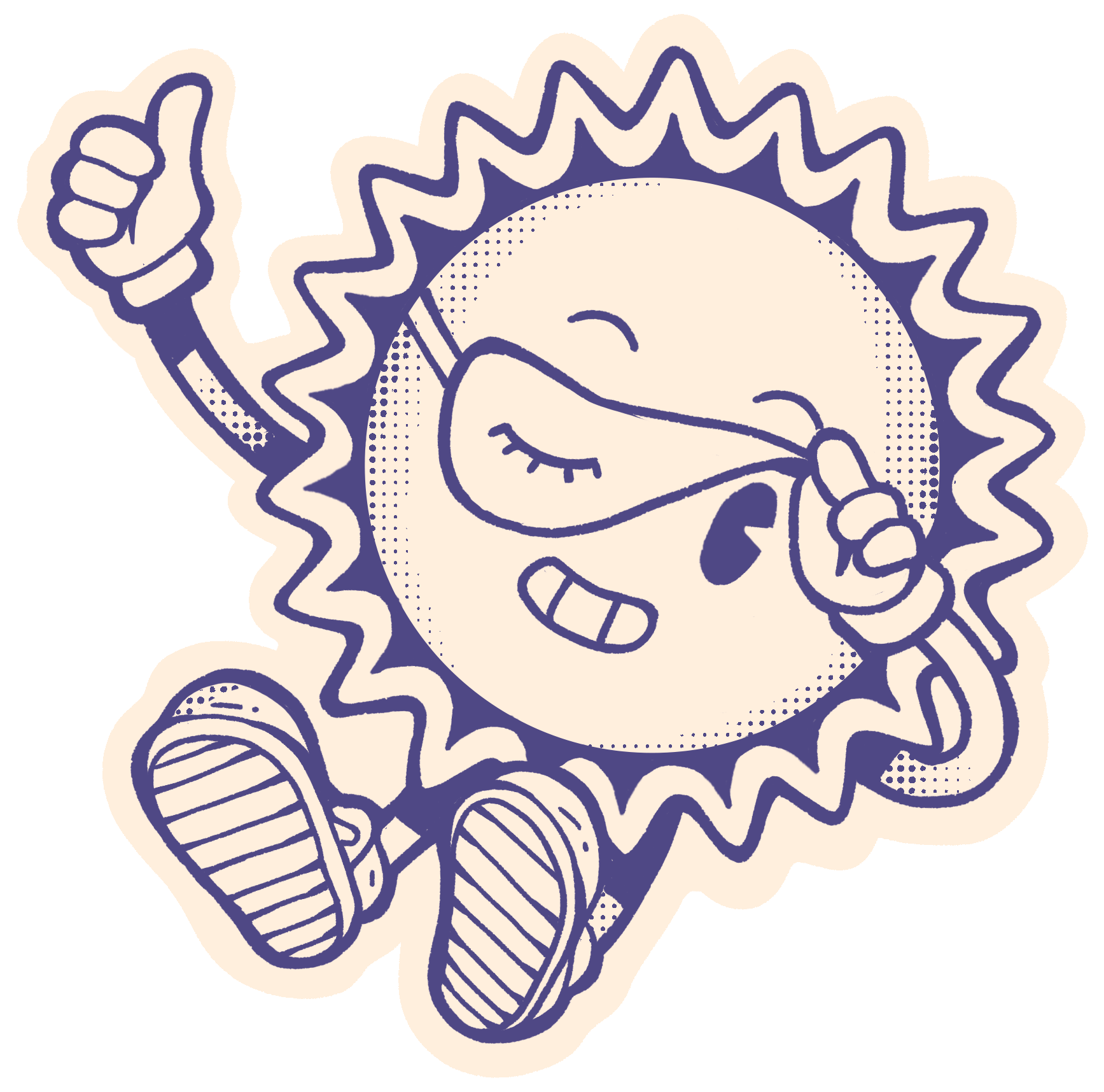
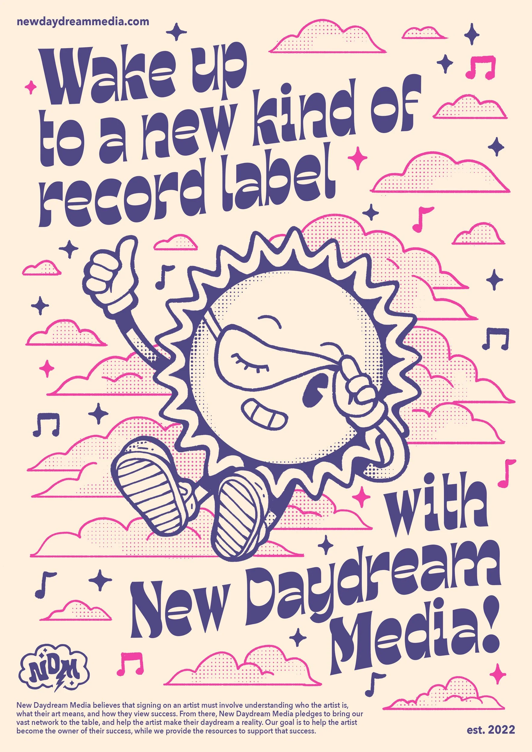
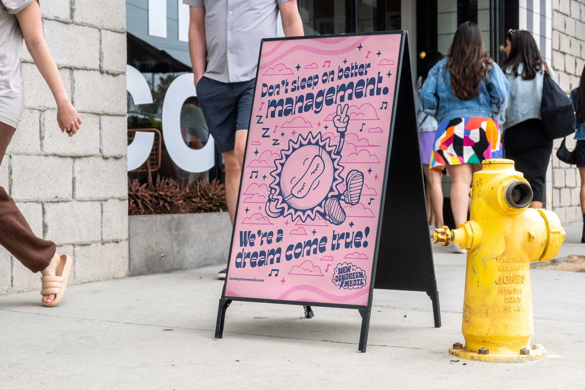
The Mascot
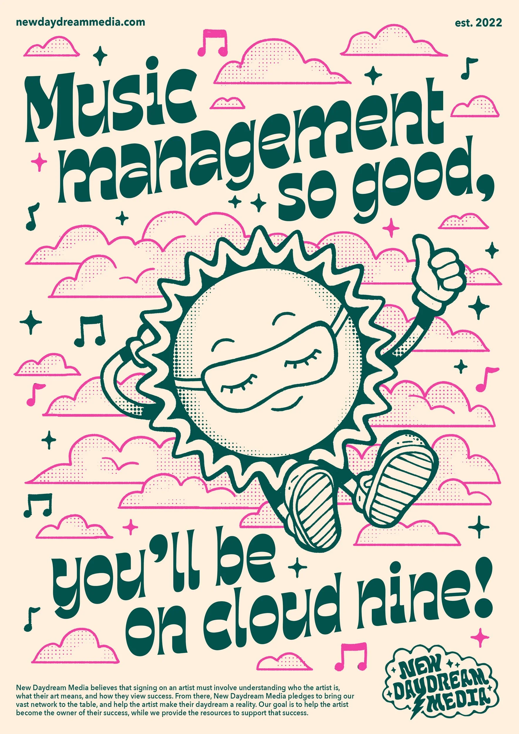
As mentioned above, during the logo ideation process we settled on a mascot concept of this sun character with a sleep mask on. It was a visual representation of the “daydream” concept, and was meant to be reminiscent of vintage mascots and old tube animation characters. This vintage aesthetic was meant to evoke feelings of approachability, simplicity, and lightheartedness.
Identity
Development
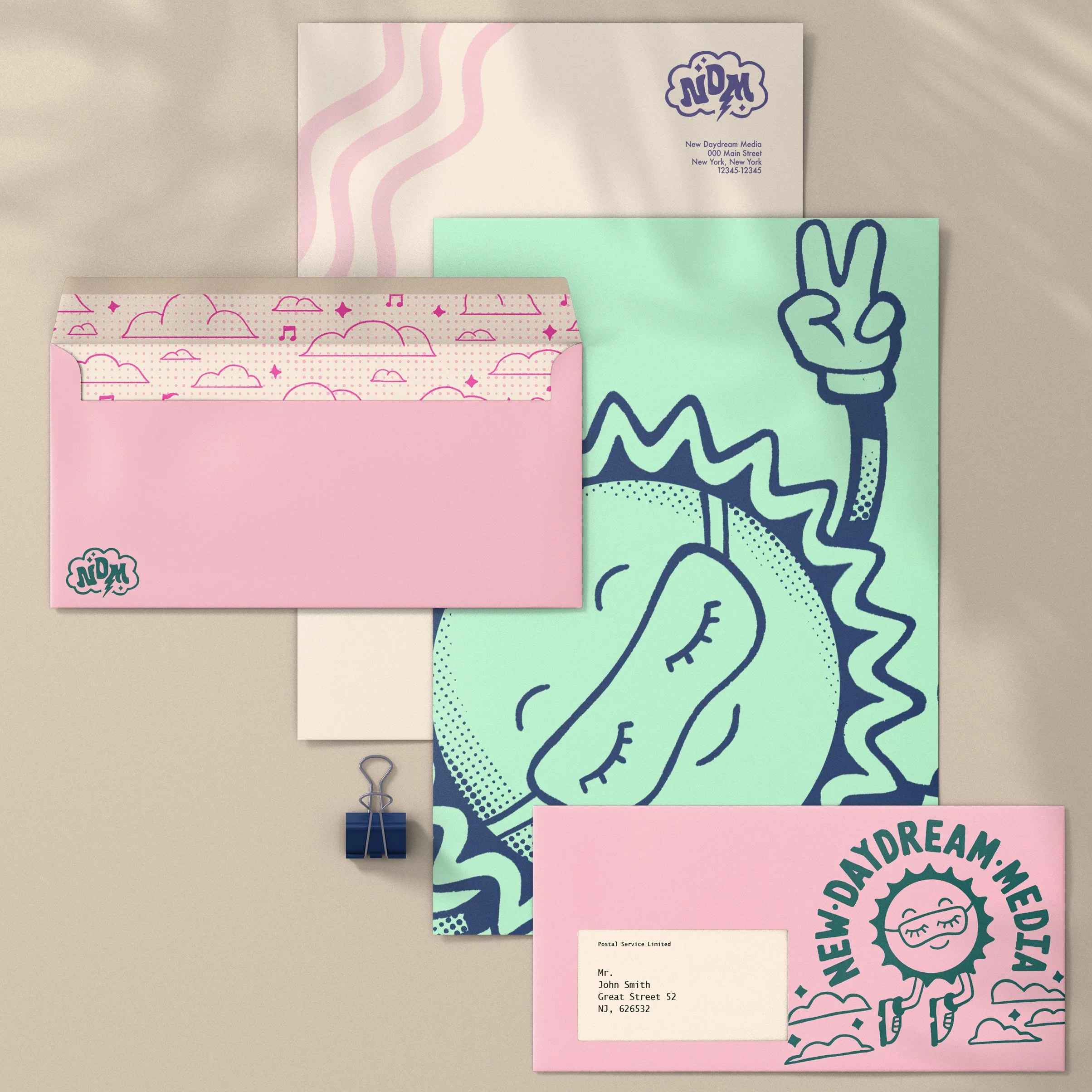
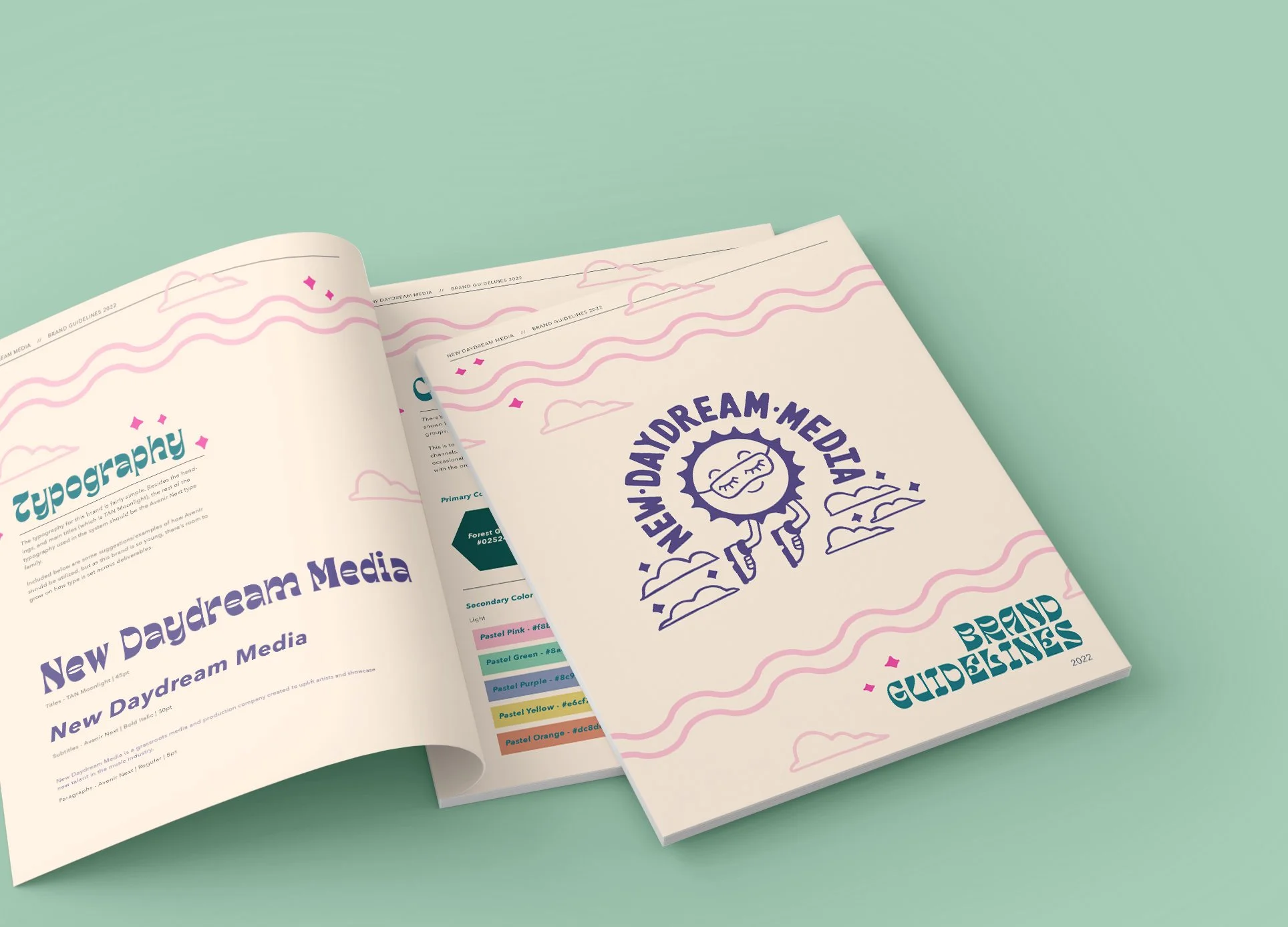
Once the logo and mascot concept were firmly established, we moved into fleshing out the rest of the identity. The keywords we kept in mind throughout this development process were “approachable”, “dreamy”, and “comforting”. These were the feelings the client wanted to most represent visually, so all aspects were meant to support this throughline.
The pastel and neutral tone color palette evokes a feeling of lightheartedness and balances well with the halftone textures and soft illustrative elements (discussed more below). The typography is playful and wavy, meant to evoke other elements of the system like the clouds and the wave line graphical elements.
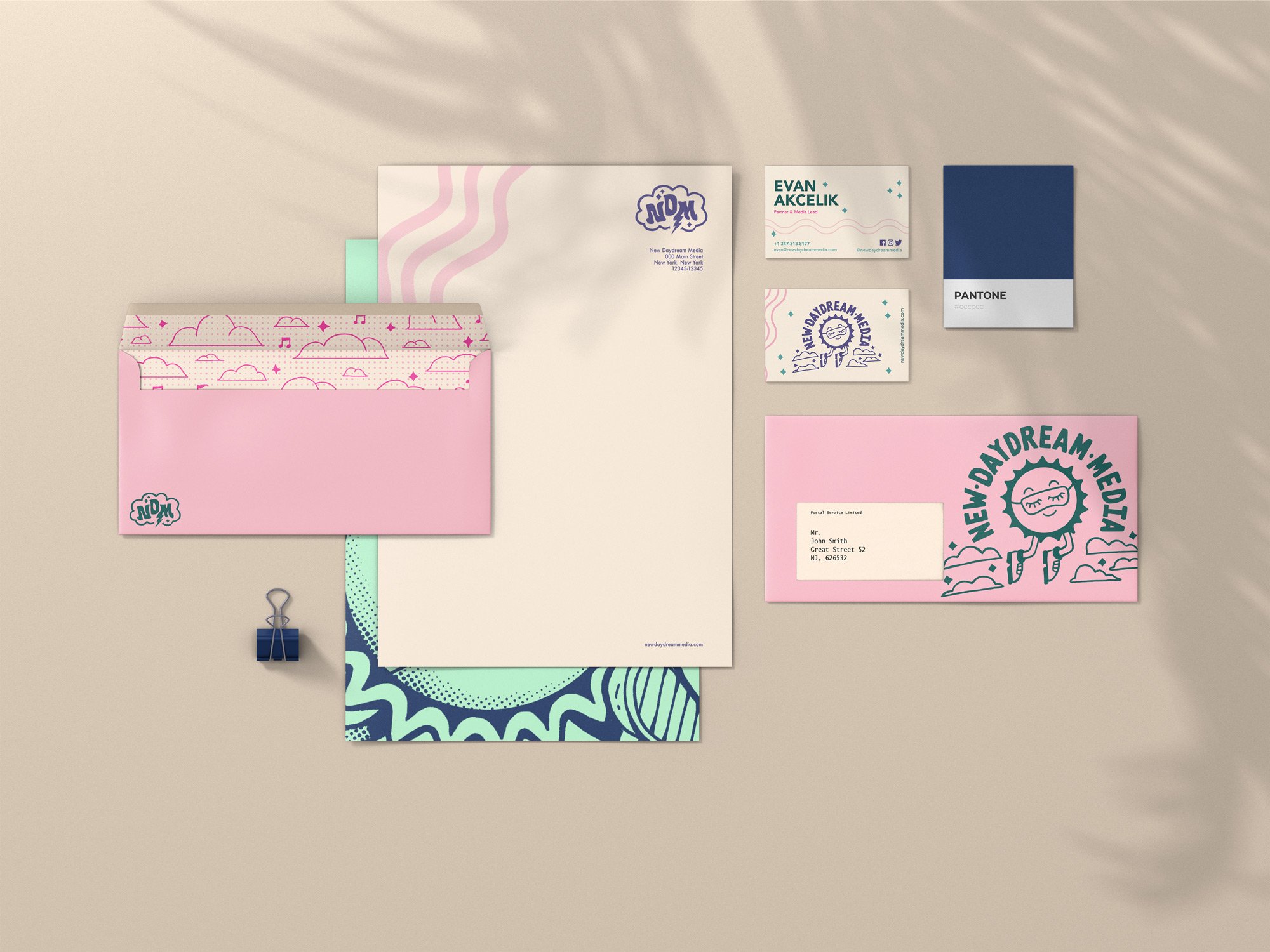
Illustration
The illustration style expanded on the direction of the logo but added a layer of complexity, bringing in some texture in the halftone effect and layering with the graphical elements like the stars and music notes.
The intention was to fully embrace the vintage feeling established by the logo development and bring it to a larger scale. Through this, the brand system adds in some texturing to highlight a handcrafted and playful style.

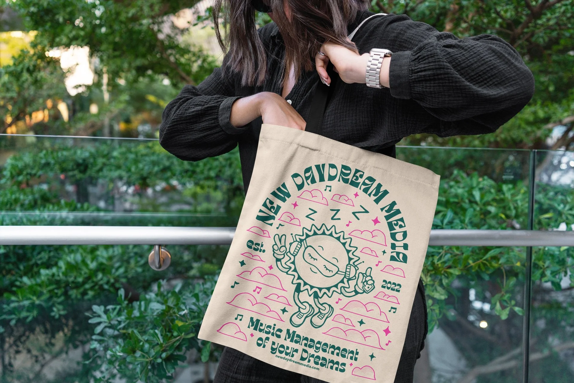
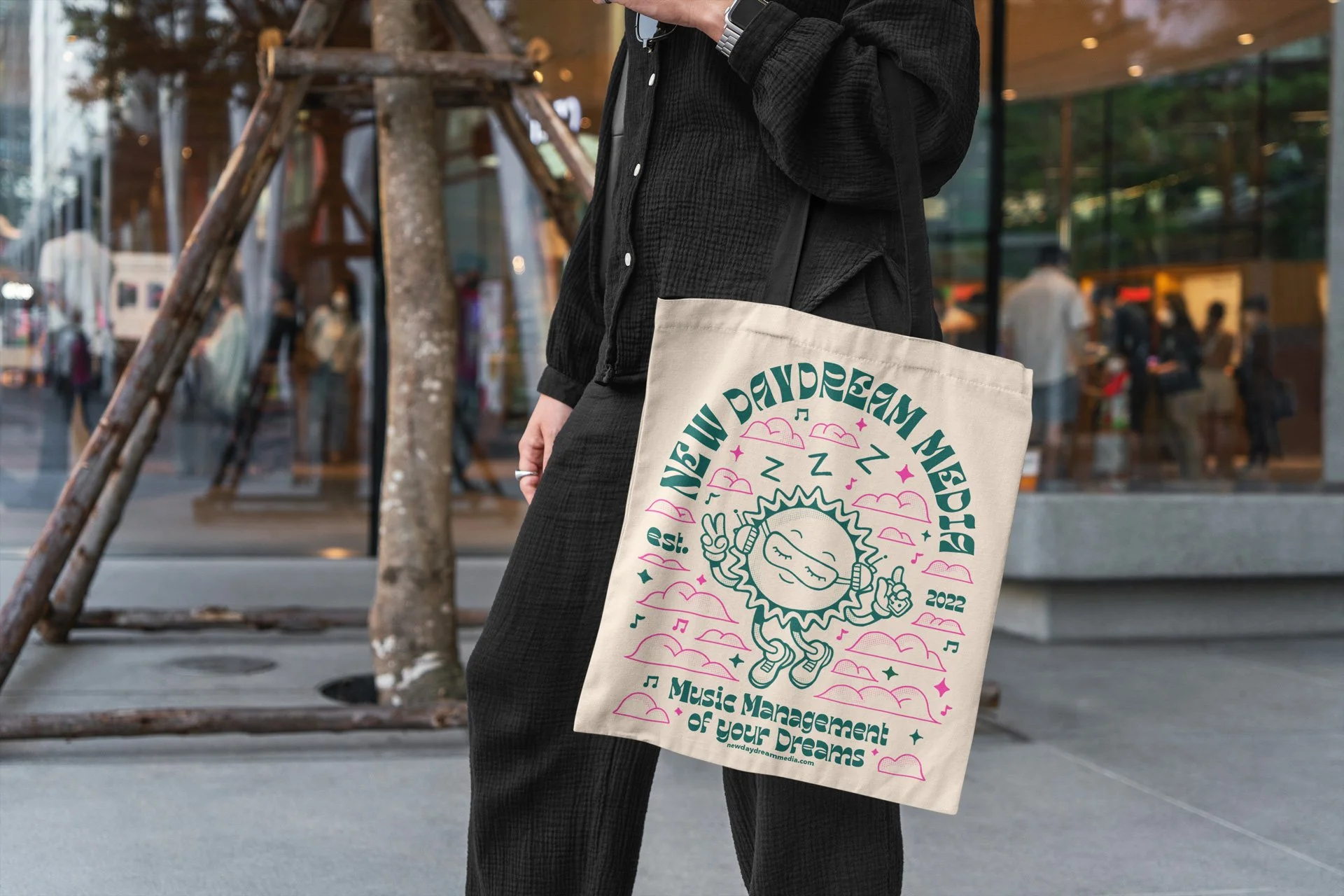
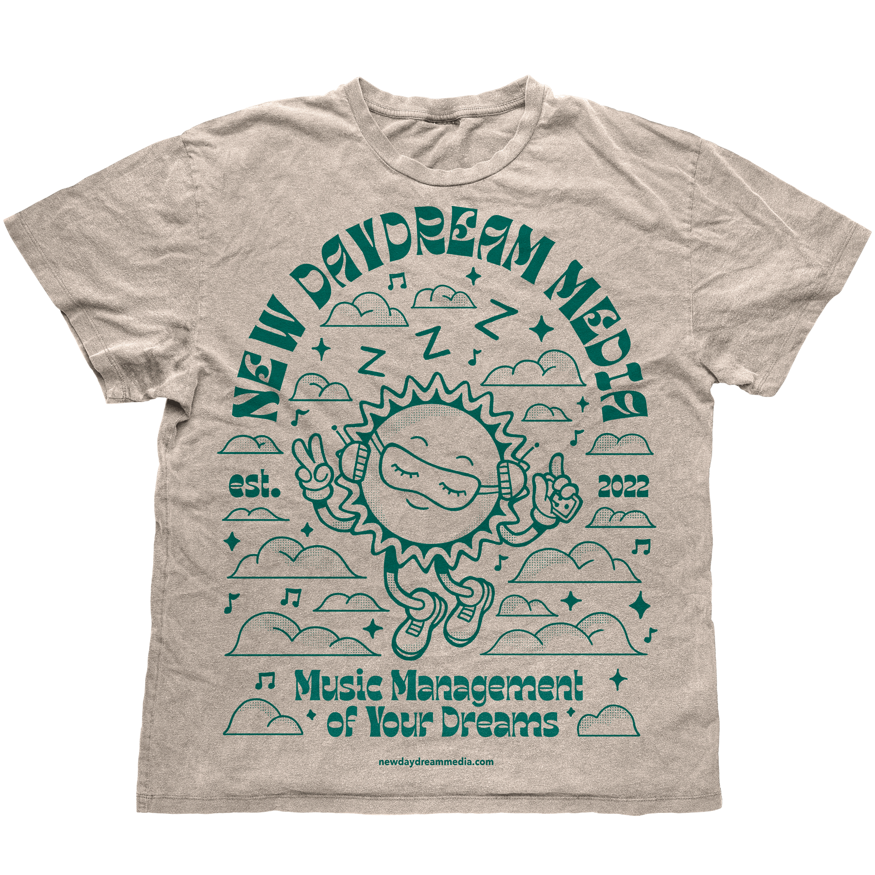
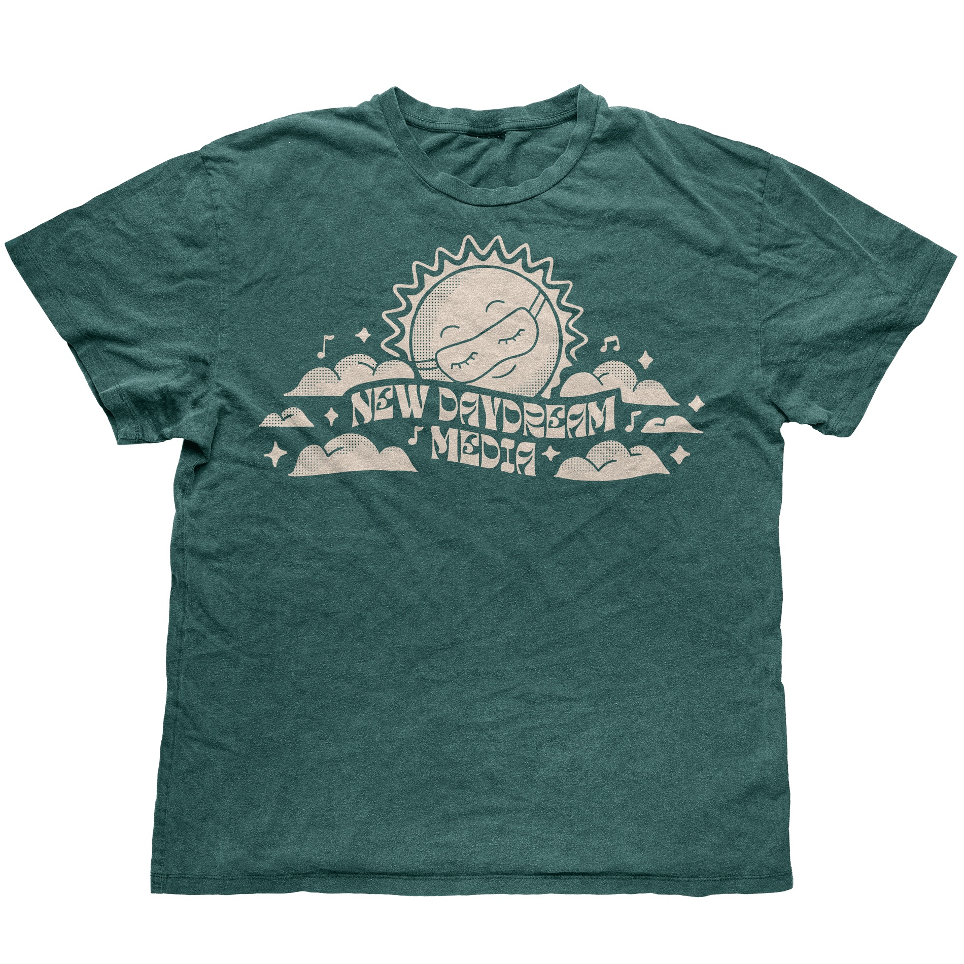
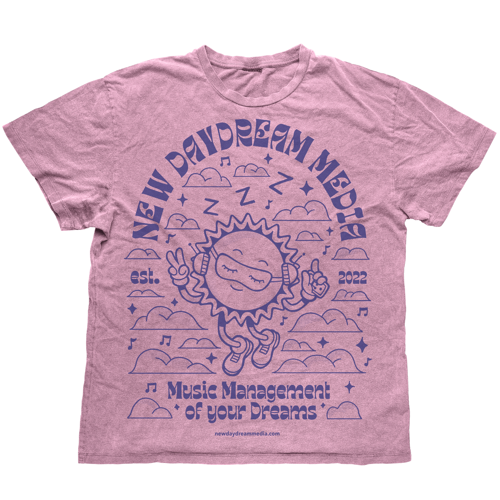
The Merch
Design
With the lighthearted and natural look established by the brand identity, it allowed for an opportunity to explore some different materials and textures for merchandise that would work cohesively with the brand.
Natural fabrics of T-shirts and untreated canvas of tote bags further emphasized the “approachable” and handcrafted nature that the brand wanted to convey with neutral colors working seamlessly with the color system and typography choices.
The Brand Launch
The brand launched in January of 2023, offering music management, education, and additional serviced to indie level musicians breaking into the industry.
Overall. combined with the departure in aesthetics from my usual illustration style and softer design elements, this was a unique exercise in brevity, whose brand identity offers a softer and more comforting to a fast paced and sharp industry.